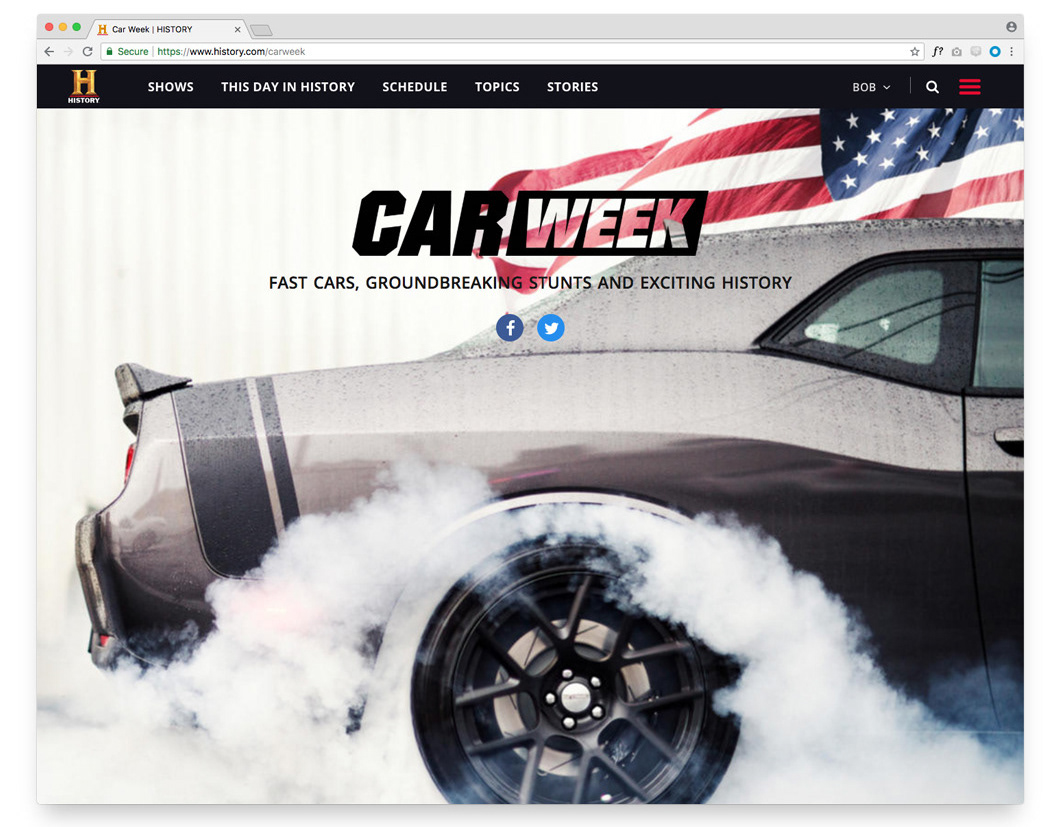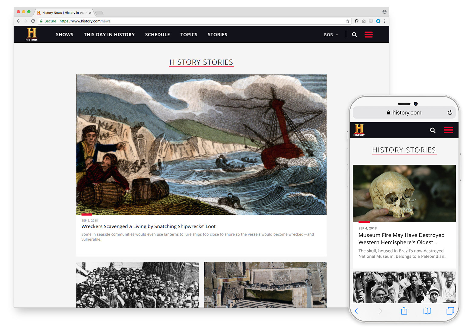
The entry point to the stories landing page allows users to visually browse the content available with big, bold photography leading the way. Everything we designed was responsive, and every viewport was covered.
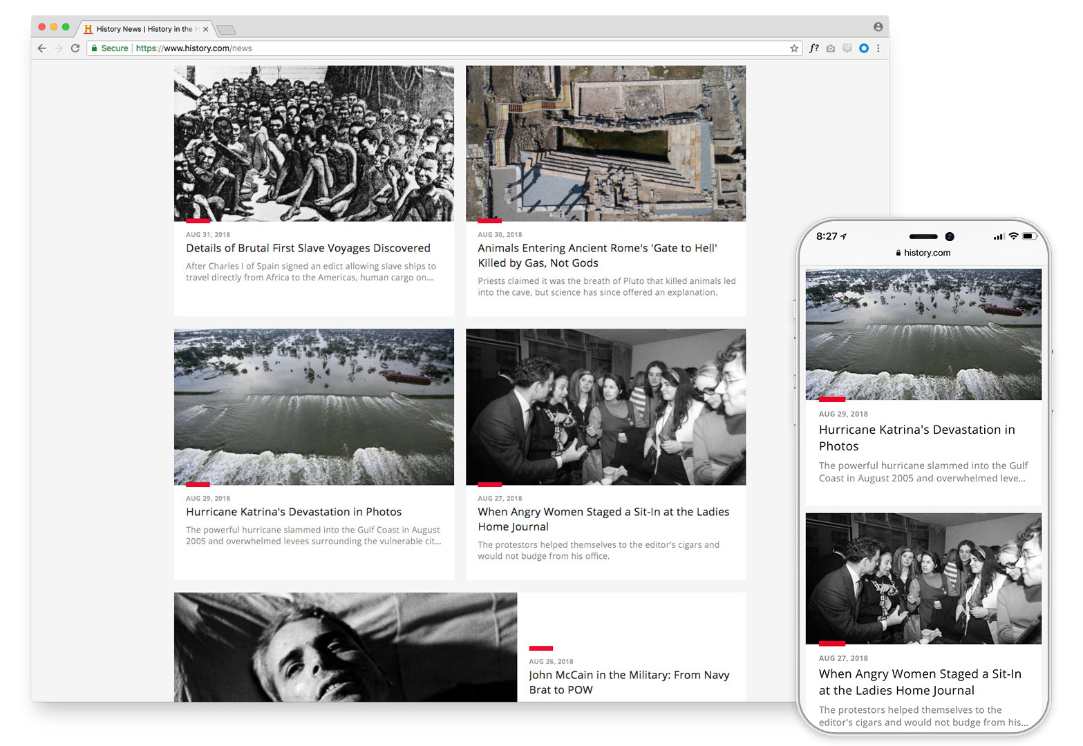
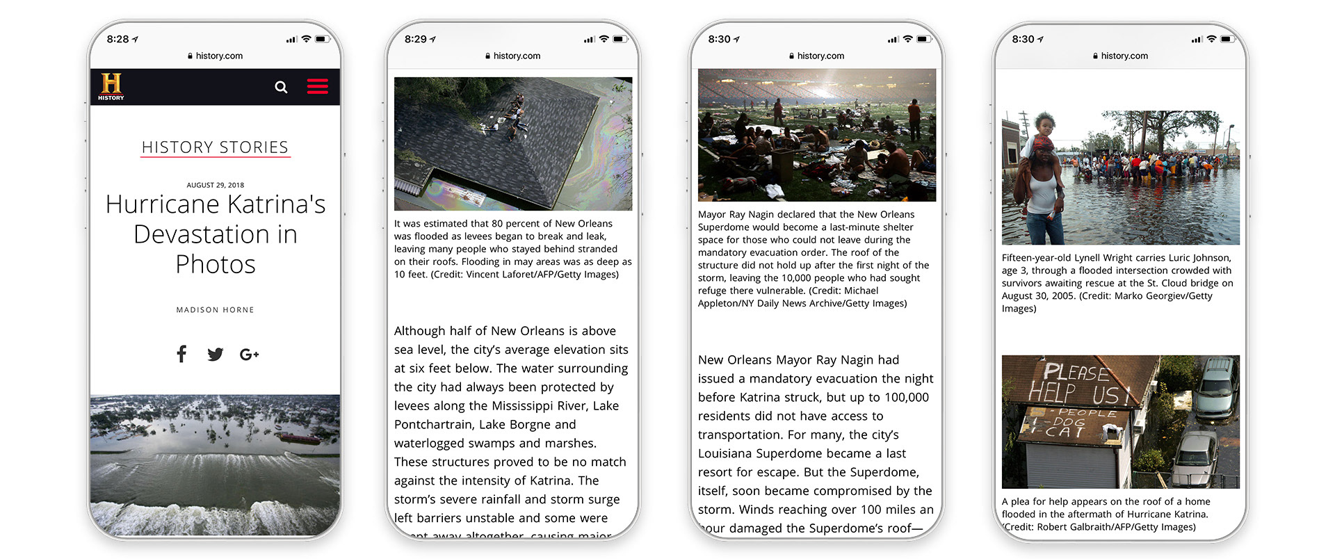
As you scroll down the landing page, content is clearly blocked out in a card style display which allowed for easy and simplified mobile viewing as well.
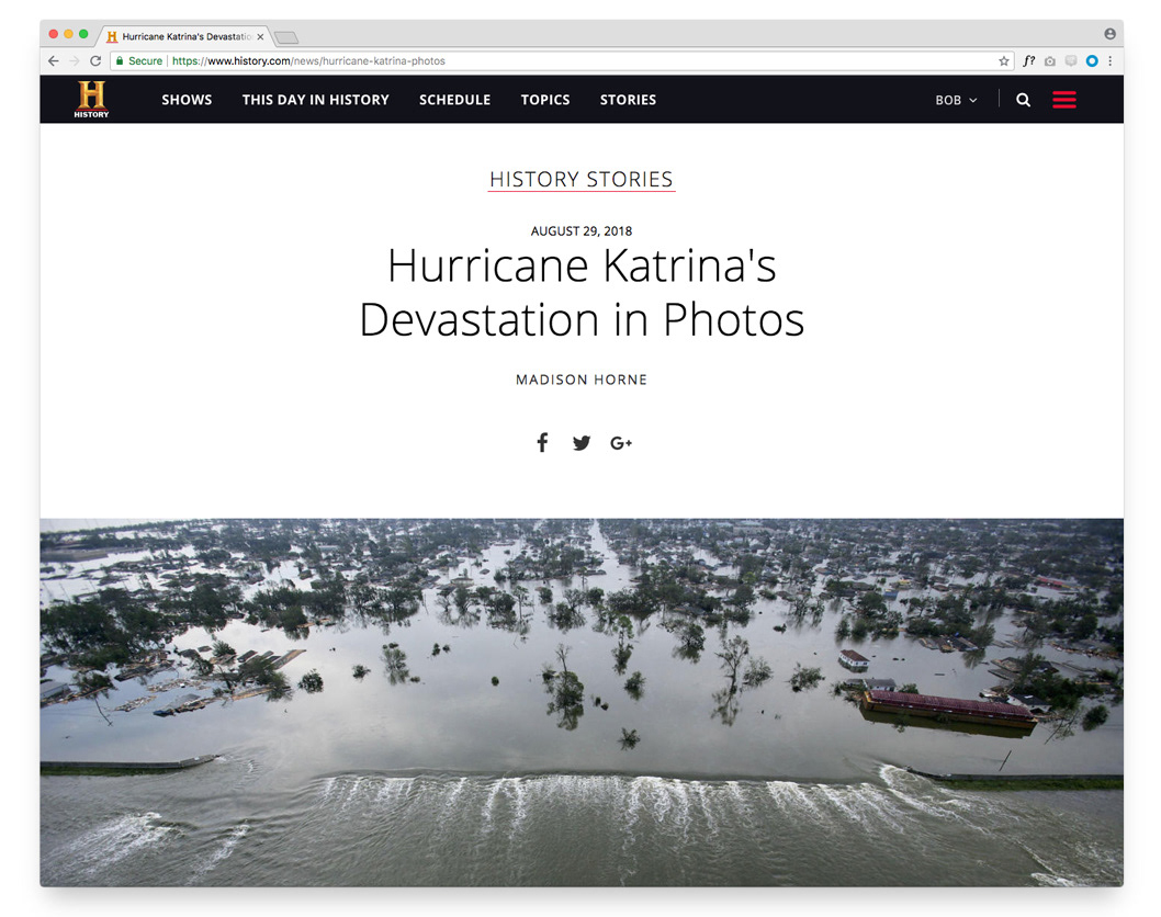
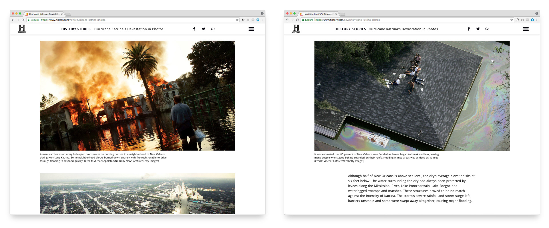
The use of negative space played a key role in the design of the experience - creating space for the eye to rest, while also allowing users to really engage in the photography and blocks of copy.