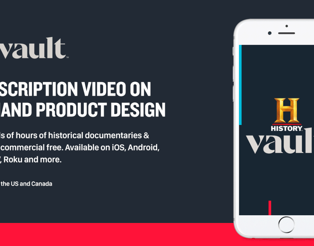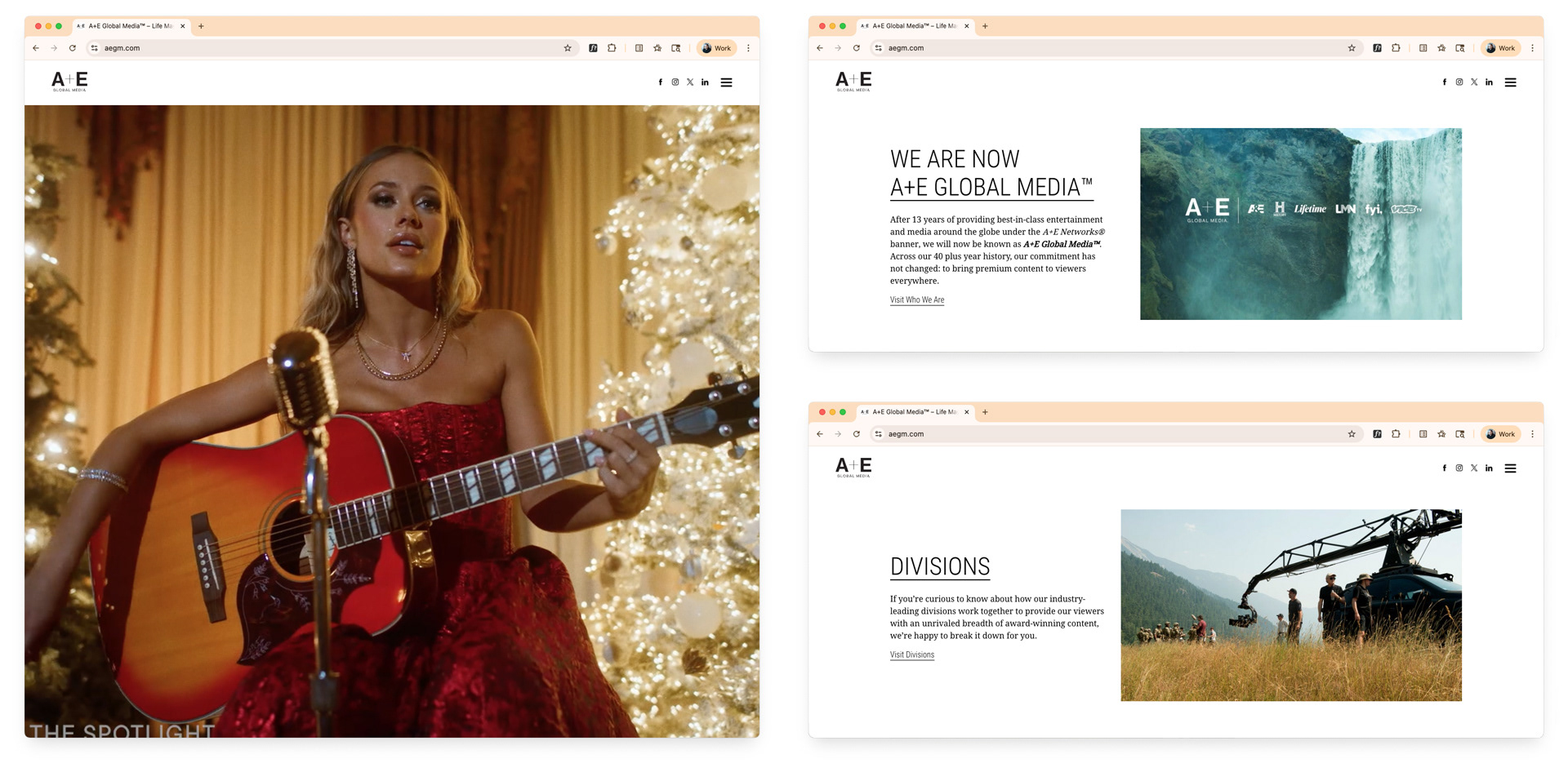
A+E's corporate site is the first impression used to evaluate their character and quality of their business. The intention is to improve external optics in the industry. The Home Screen starts by greeting users with a full screen sizzle reel highlighting top content across the portfolio. Scrolling down allows you browse sections at a high level. A simple click takes you on a deeper dive into each category.
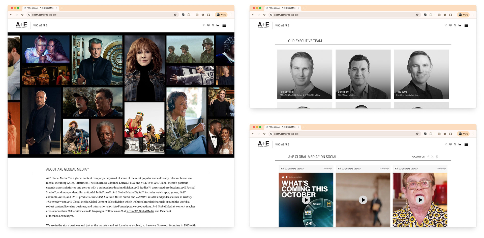
The site provides information about the company history, showcases leaders and executives, the latest news, and more. It's an intuitive, seamless and fun experience supported by templates and reusable components that ensure easy scalability and consistency throughout the site.
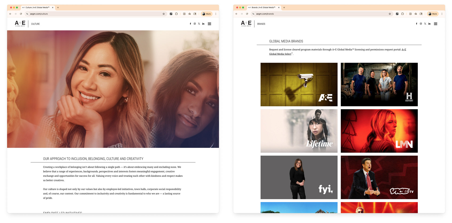
The Culture section helps to provide more transparency about internal culture. Showcasing the portfolio of media brands helps users understand the depth, breadth, and value of the portfolio A+E owns and operates.
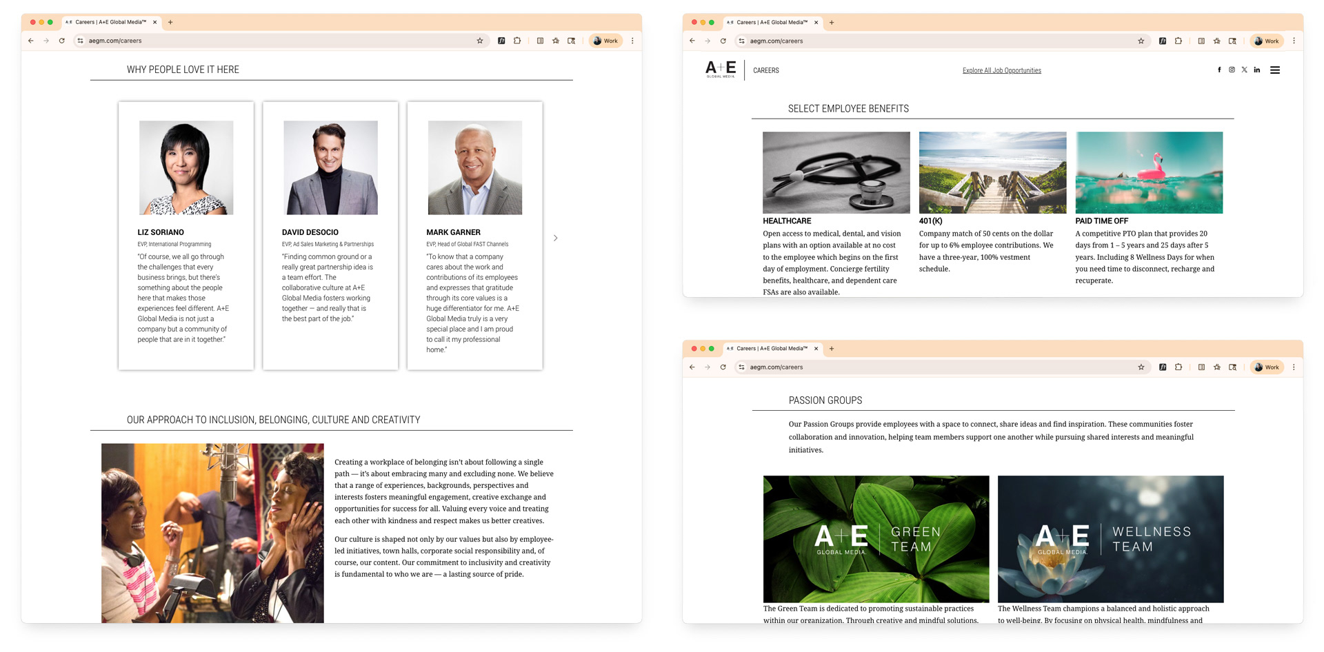
The careers section helps to improve applicant quality and quantity, providing transparency about why people love to work there, the types of groups you'll have access to, as well as benefits.
This solution was not a short-term solution. It was a very thoughtful and thorough execution that will require minimum upkeep and have a very long shelf life.