INTERACTIVE CAMPAIGN, B2B MARKETING
Avaya UC Profiler: When B2B Gets a Sense of Humor
Enterprise software has a perception problem. The capabilities are real, the business value is demonstrable, but the experience of learning about them rarely makes anyone want to engage.
The concept was simple and strategically sound: instead of leading with product features, lead with the user's own pain. A series of questions, framed around recognizable, relatable workplace frustrations rather than technology preferences, walked users through a communication efficiency assessment, with humorous animations bringing each scenario to life. By the time the results screen appeared, users had diagnosed their own communication gaps and received a personalized set of Avaya feature recommendations to address them. The product had been introduced not as a pitch, but as a solution the user had arrived at themselves.
A central component of Avaya's broader Unified Communications campaign, the UC Profiler combined quiz mechanics, character animation, and consultative UX to turn a B2B awareness tool into something people actually wanted to complete, and share with colleagues.
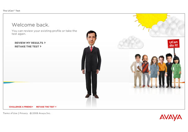
UCan Test - welcome back screen with bobblehead character and team illustration
The experience opened with a return visit screen that immediately established the tone: warm, playful, and nothing like enterprise software. A bobblehead-style illustrated character stood front and center as the user's avatar, while a cheerful group of similarly styled colleagues clustered in the background, one holding a "UCan do it!" sign. Two clear paths (Review My Results and Retake the Test) kept the interaction simple and the return visit frictionless. "Challenge a Friend" at the bottom extended the campaign's reach through social sharing, turning a single user's experience into a mechanism for organic distribution.

UCan Test - question 4, slider response mechanic
Rather than asking users about technology features or software preferences, the questions were framed around real, recognizable workplace frustrations. Question 4: "When I need to contact my colleagues, I have no idea if they're available or how to best reach them." A slider running from Disagree to Strongly Agree let users self-identify their pain level on a spectrum rather than forcing a binary choice. The approach was deliberate: by asking users to reflect on their own communication inefficiencies first, the profiler created the problem-awareness that made subsequent product recommendations feel like solutions rather than sales pitches. The bobblehead avatar stood beside each question as a constant companion - present, neutral, and just absurd enough to keep the experience feeling lightweight. A progress indicator and Skip option kept users in control of the pace throughout.
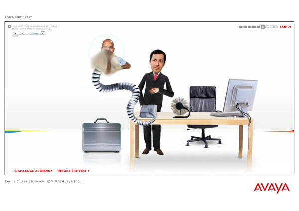
UCan Test - animated question screen, phone cord entanglement gag
A question about using a single number for business and never missing a call triggered an animated sequence showing the avatar being physically overwhelmed by an impossibly long, coiling telephone cord, a caller's disembodied head emerging from the receiver as the cord wrapped itself around the scene in a visual metaphor for the communication chaos the question described. The animation was brief, specific, and genuinely funny - the kind of moment that made users laugh in recognition before answering. The design decision behind it was sharp: humor reduced resistance. A user laughing at an animated phone cord was a user who felt understood rather than sold to, and a user who felt understood was far more likely to engage honestly with the question that followed. The animations transformed what could have been a dry B2B assessment tool into something people actually wanted to complete.

UCan Test - animated question screen, desk racing gag
Question 7 addressed the time lost to typing messages during busy periods, and the animation that accompanied it was the campaign's most visually inventive moment. The avatar and a colleague appeared strapped into racing harnesses behind their desks, fitted with wheels and steering wheels, as if the mundane act of sitting at a computer had been transformed into a competitive race. The gag captured the feeling of being perpetually behind, always catching up, never quite getting ahead. Each animation was doing triple duty: entertaining the user, embodying the pain point, and keeping the Avaya brand present without feeling like an interruption.

UCan Test - animated question screen, desk phone gag
Question 9 tackled one of the most universally felt workplace frustrations: being tethered to a desk phone at the end of the day, stuck in the office waiting for a call that could reach you anywhere. The animation made the metaphor literal - the avatar flat on his back, physically chained to his desk phone by the cord, unable to leave. The briefcase sitting nearby ready to go made the joke land harder: he was packed, he was ready, and the phone had other plans. Of all the animations in the profiler, this one was the most universally relatable, regardless of industry, role, or seniority, almost everyone who has ever worked in an office has been that person, briefcase packed, waiting for the phone to stop ringing.

UCan Test - results screen, "Conventional Communicator" profile with feature recommendations
The results screen was where the profiler's strategic architecture paid off fully. A large, confident score of 49 anchored the upper left, accompanied by a profile type: "You're a Conventional Communicator." The framing was careful: not a failing grade, not a judgment, but an honest assessment with an immediate path forward. A benchmark slider showed where the user sat relative to other end users, adding social comparison that made the score feel contextual rather than absolute. Below, three columns organized specific Avaya feature recommendations by communication dimension (Fast, Collaborative, and Flexible) each with a brief explanation of the gap identified and a short list of product features to address it. The profiler had done its job: turned self-reported communication pain into a personalized product roadmap, without ever feeling like a sales pitch.

UCan Test - results screen, expanded feature detail panel "Easy Mobile Switcher"
Selecting any recommended feature expanded an inline detail panel, keeping the user within the experience rather than navigating away to a product page. The "Easy Mobile Switcher" panel demonstrated the format: a plain-language headline, a two-sentence explanation framed entirely around the user's situation, and a Learn More link for users ready to go deeper. The interaction model was patient and user-directed: no autoplay, no forced navigation, no pressure. The information was there when the user wanted it and invisible when they didn't. For a B2B campaign tool built in 2008, the UX thinking behind it was remarkably considered and it holds up.