MARKETING CAMPAIGN - PRINT & DIGITAL
Some copy has been blurred in order to keep the pharmaceutical company anonymous.
Perfect Partnership: Global Creative Studios Campaign
An in-house creative agency inside a global pharmaceutical company had a new name, a new director, and a new mandate: be taken seriously as a creative partner by the internal clients who could just as easily go outside.
The challenge was familiar to anyone who has led a creative team inside a large organization - the in-house agency is often the last to apply its own capabilities to itself. The solution was a full internal marketing campaign built around a single, genuine insight: the best creative work happens in partnership, not transaction. When a client and an agency are truly aligned, when the relationship functions like a perfect pair, the outcomes are better for everyone.
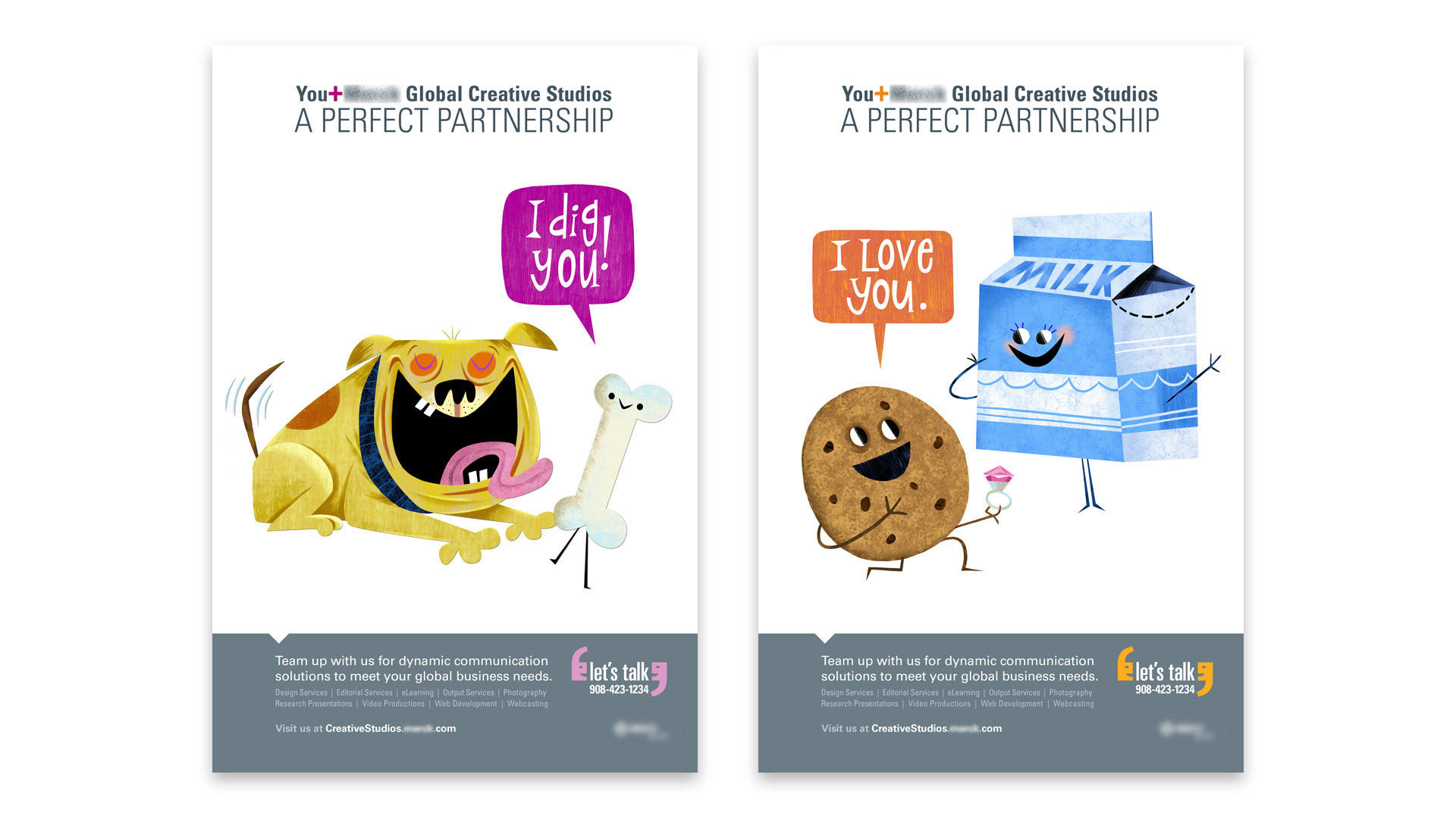
Campaign posters - "A Perfect Partnership" series, dog and bone / cookie and milk
The campaign's central idea was right there in the headline: You + Global Creative Studios = A Perfect Partnership. The challenge was making that feel like anything other than a corporate tagline — and the answer was whimsy. Custom illustrations of iconic symbiotic pairs (a dog deliriously devoted to a bone, a cookie proposing to a carton of milk) delivered the partnership message with warmth, humor, and a visual personality that had no business existing in a pharmaceutical company's internal communications. Talk bubbles carrying lines like "I dig you" and "I love you" became the campaign's recurring device, with the "Let's Talk" tagline and a direct phone number anchoring each poster alongside a full list of agency services. In a corporate environment saturated with predictable messaging, a cookie proposing to a milk carton got noticed. That was precisely the point.
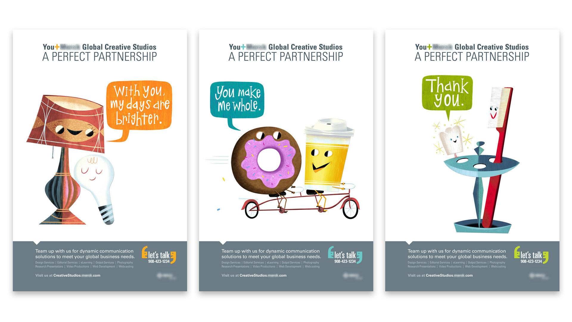
Campaign posters — lamp and bulb / donut and coffee / tooth and toothbrush
Three more pairs, three more puns, each one landing with the same warmth and wit as the first. The illustrations were custom-created for each poster, characters with personality and physical comedy, inspired palette that felt retro and fresh simultaneously. The campaign's visual system was consistent across every execution: bold talk bubble, handwritten-style copy, illustrated pair, gray footer with services and the "Let's Talk" tagline. What made the series work was the cumulative effect, each new pair reinforced the partnership concept from a different angle, with a different joke, keeping the campaign feeling generative rather than repetitive.
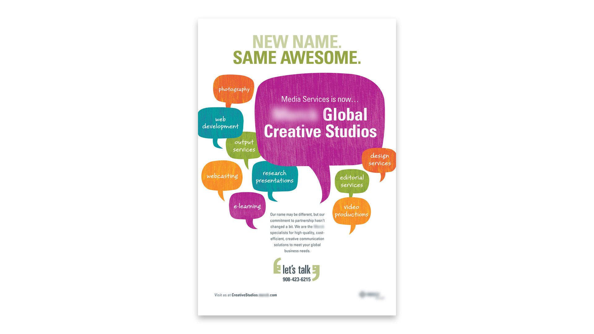
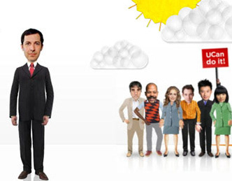
Rebrand announcement poster - "New Name. Same Awesome"
The campaign also had a practical job to do: announce that the department formerly known as Media Services had a new name, Global Creative Studios, and make sure every employee in the building knew what it offered. "New Name. Same Awesome." handled both with the same confident voice running through the rest of the campaign - direct, self-assured, and just irreverent enough to feel like it came from a creative team rather than a communications department. The talk bubble motif carried over as an organizing device, eight colorful bubbles surrounding the central name announcement, each one naming a service. The full capabilities of the agency, communicated at a glance, without a bullet point in sight.
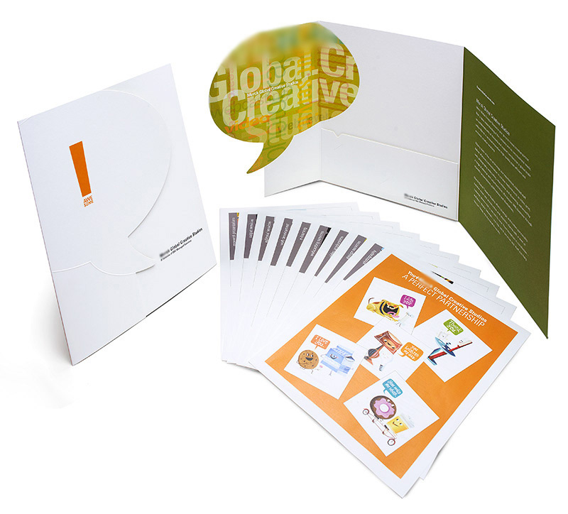
Media kit - three-fold die-cut folder with embossed talk bubble, service one-sheets
The campaign extended into print with a media kit that matched the ambition of the posters in both concept and craft. A three-fold folder die-cut into the shape of a talk bubble, the campaign's central visual device, opened to reveal an interior panel and a pocket holding a full set of service one-sheets. The cover carried an embossed talk bubble beneath a clean orange exclamation mark, the texture visible before the piece was even opened. An overview sheet displaying the full Perfect Partnership cast served as an introduction to the agency's creative personality before a word of services copy had been read. The kit was designed to earn its place on someone's desk rather than immediately finding its way into a recycling bin - a physical object with enough craft and personality to be kept.
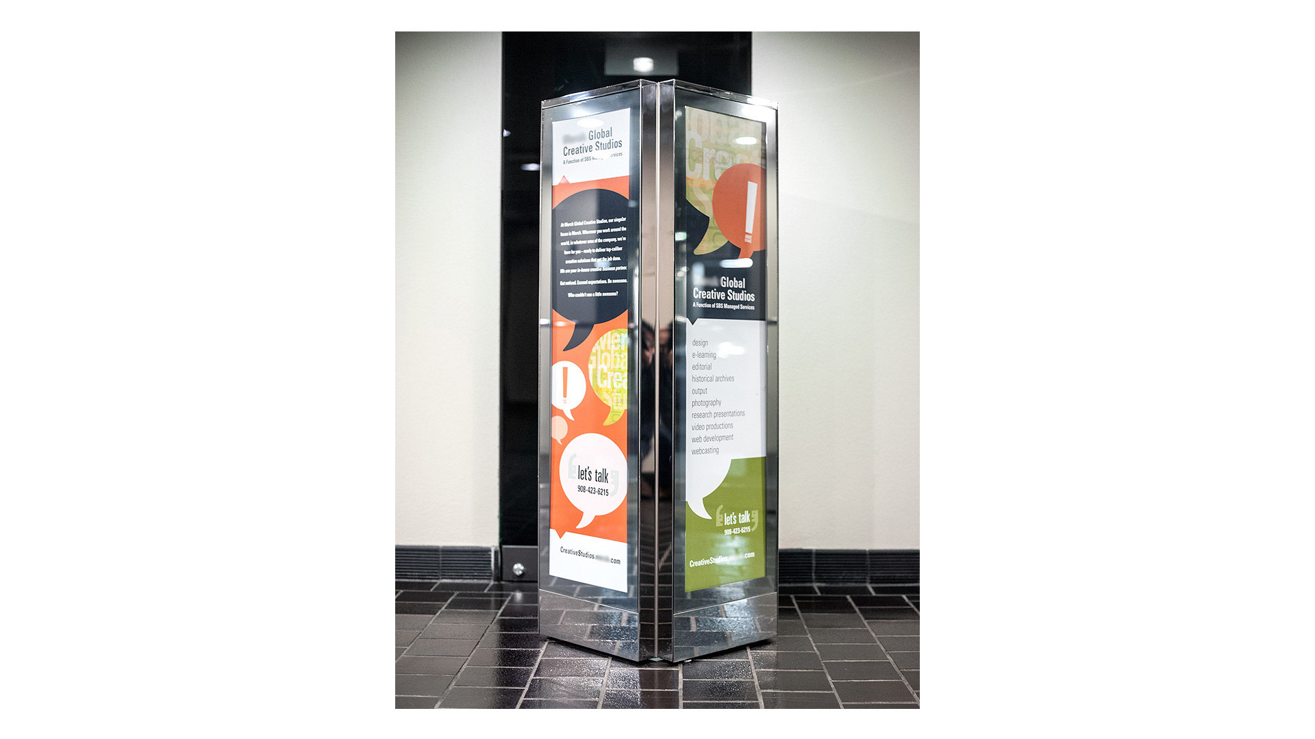
Employee entrance signage - illuminated freestanding display kiosk
The campaign met employees before they even reached their desks. Illuminated freestanding display kiosks installed at employee entrances throughout the building carried the Global Creative Studios brand in the same bold talk bubble visual language , each face presenting a different aspect of the agency's identity. The kiosks were designed to be read in passing, a commuter-sized communication format that worked at the pace of someone walking through a door rather than sitting at a desk. The chrome frame and illuminated panels gave the piece a retail-quality presence that reinforced the campaign's central message by example: an in-house agency serious enough about its own brand to invest in it was exactly the kind of creative partner worth calling.
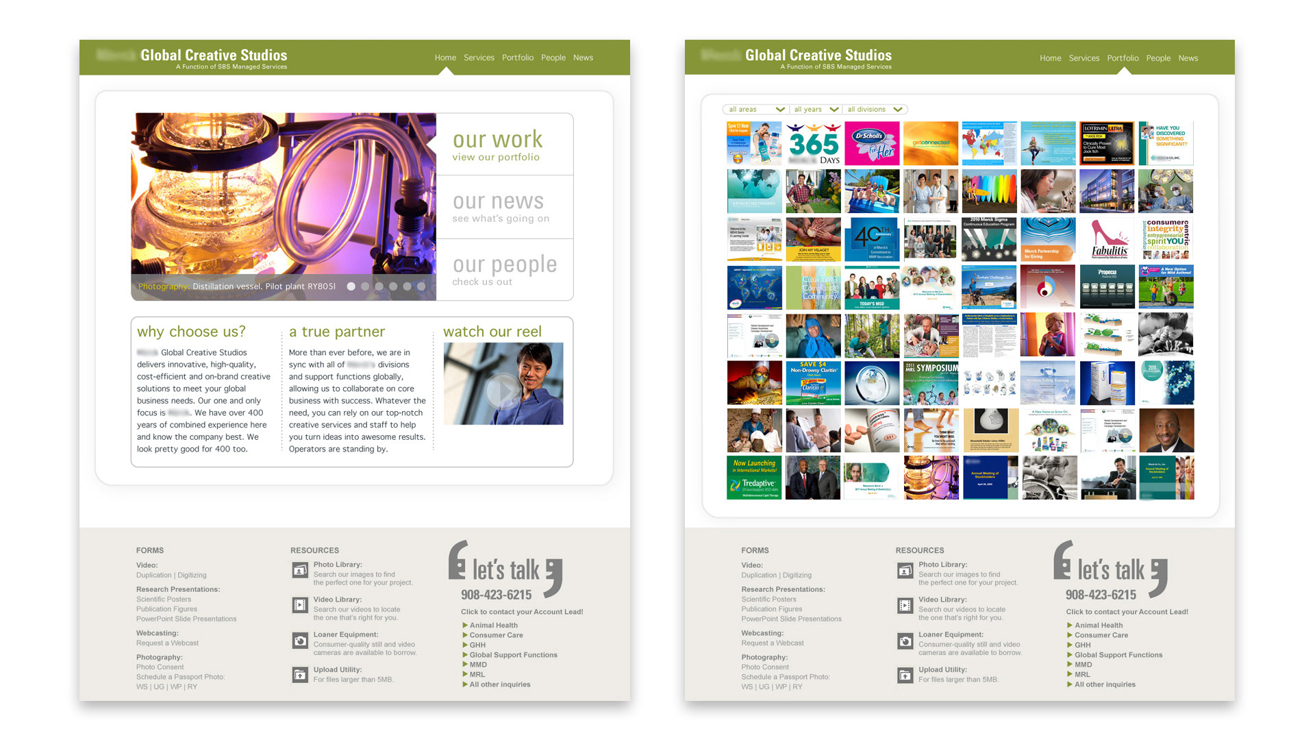
Agency website redesign - home page and portfolio gallery
The campaign extended online with a complete redesign of the Global Creative Studios internal website. The home page led with a rotating photographic hero, three clear navigation paths (Our Work, Our News, Our People) and two editorial blocks making the case for partnership directly. The "Let's Talk" device anchored the footer alongside a comprehensive resources section, making the site genuinely functional as a client-facing tool. The portfolio gallery told the agency's story most efficiently: a dense, filterable grid of work spanning every service offering, organized by area, year, and division - demonstrating in a single scrollable view the full breadth of what the team could produce. For any internal client wondering whether the agency could handle their project, the gallery answered the question before they had to ask it.
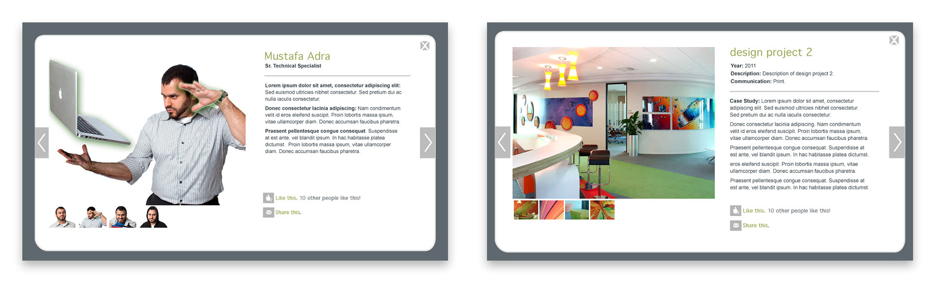
Website detail - team member profile and project case study modal views
The website's depth became apparent in its detail views. Team member profiles went well beyond a headshot and title - each person was given a full modal with a personality-forward photograph, biography, and social interaction features that brought a consumer web sensibility into an internal corporate tool. Project case study modals gave each piece of work its own dedicated view: year, description, communication type, full narrative, and a thumbnail gallery. The detail level was significant: this wasn't a portfolio that asked clients to take the work on faith. It provided context, explained decisions, and made the agency's thinking visible alongside the output - reflecting the same conviction running through the entire campaign: that an in-house creative agency should be held to the same standard as any external partner, and that the work, the people, and the process were all worth showing off.