STREAMING: LIVING ROOM, MOBILE, & WEB DEVICES
The Future of Pluto TV
Pluto TV is one of the most-watched free streaming services in the world. We executed a full-scale redesign across all endpoints, while Paramount was actively consolidating its tech stack, laying the groundwork for a premium, next-gen user experience. By integrating best-in-class components and making strategic optimizations, we’re elevating performance, usability, scalability, and engagement across the board. This initiative positions Pluto TV to better align with Paramount’s broader streaming vision, and creates clear opportunities for innovation, operational efficiency, and long-term growth.
The work ran in parallel with a broader effort to align design and engineering around a unified design system spanning Paramount's entire streaming portfolio - bringing consistency and speed to market to products that had grown in different directions. The scope was ambitious. The landscape was evolving in real time. The team delivered.
Home Experience
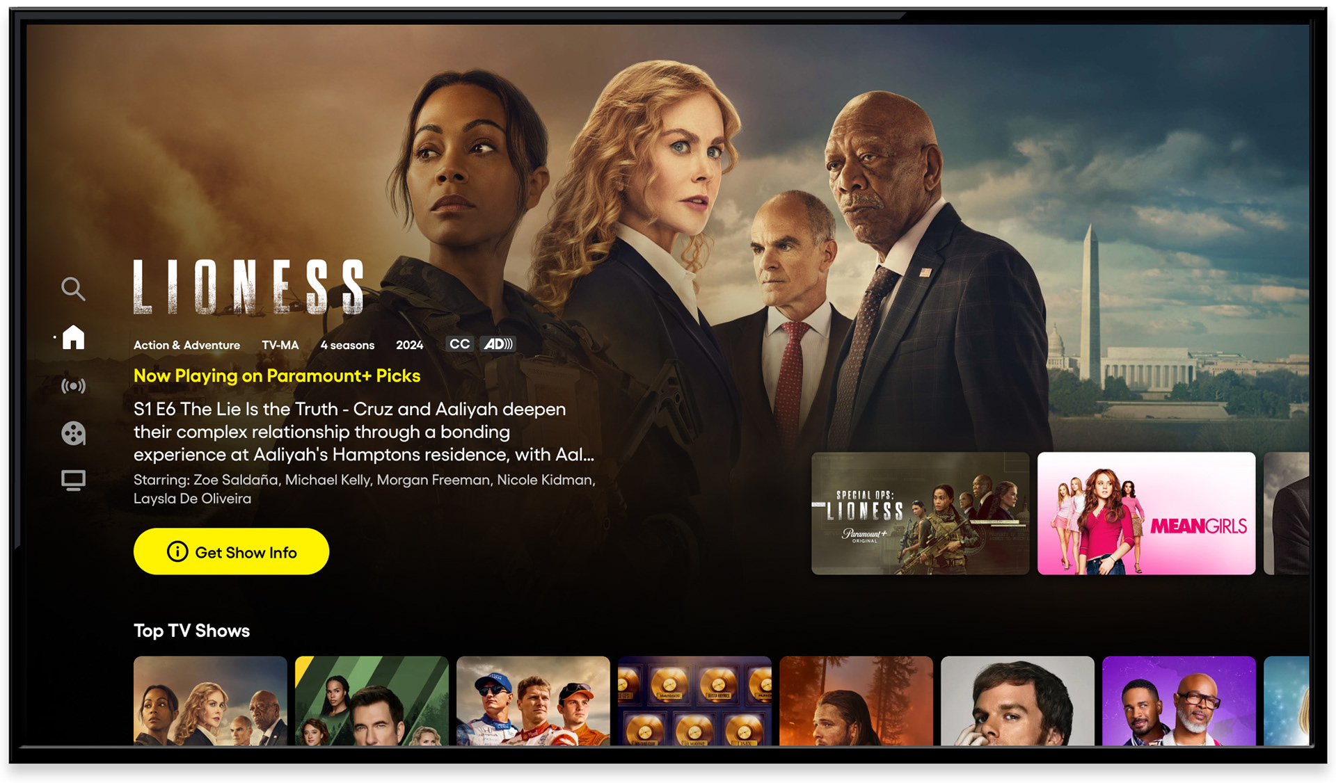
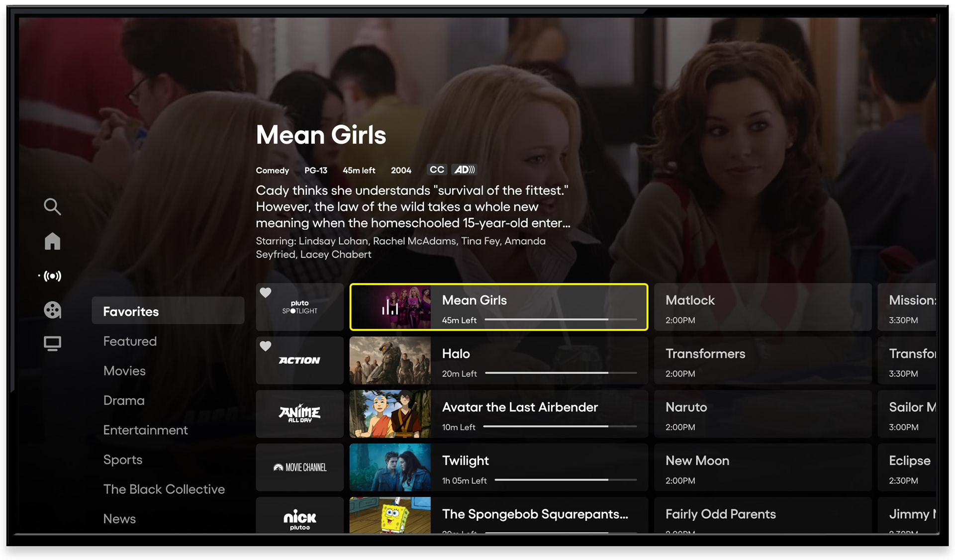
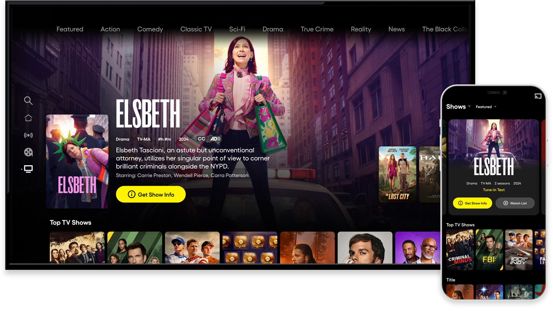
Home screen - hero marquee, CTV
The redesigned home screen opened with full-bleed artwork and a hero marquee built to convert. Content metadata, a synopsis, and a single, unambiguous call to action gave users everything they needed to make a decision without requiring additional navigation. A content hint below the marquee signaled depth, inviting users to scroll.
Home screen - content carousels, global navigation
Scrolling downward revealed a personalized content discovery layer: carousels spanning both live and on-demand content, with a focused state clearly marked by a yellow border and metadata surfaced above. Global navigation, accessible with a single left input, kept search and section browsing within reach at all times without cluttering the default home state.
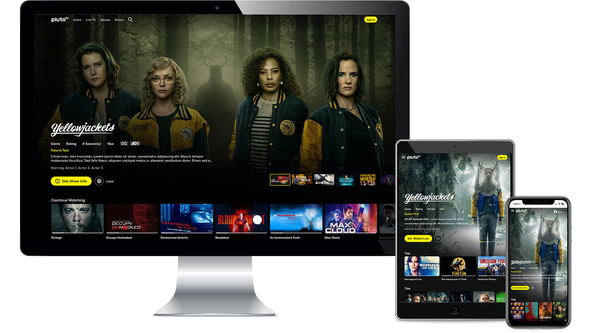
Responsive layouts - desktop, tablet, mobile
Pluto TV lives on every screen. The redesign was built to hold across all of them - from the largest living room display to the smallest mobile device - with a design system flexible enough to adapt without fracturing. Every layout decision was made with the full range of surfaces in mind.
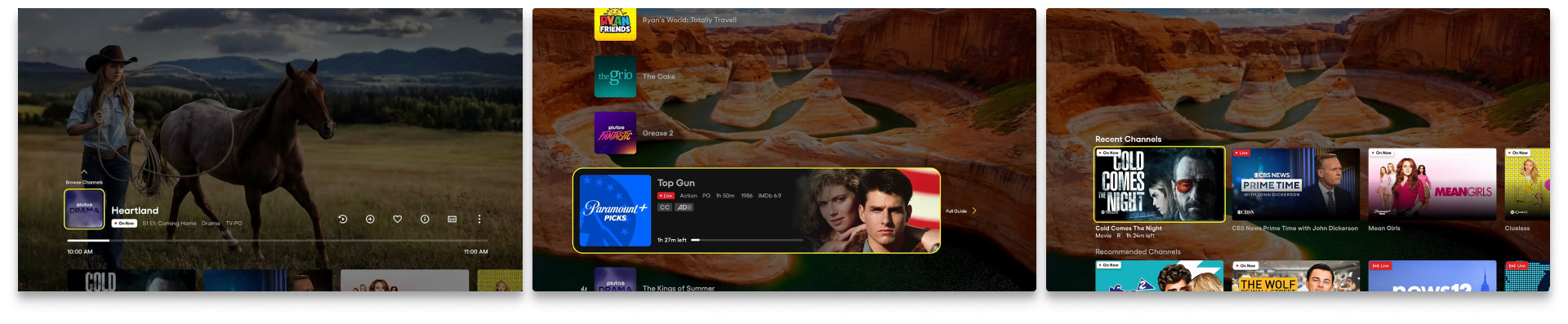
Channel Guide / Live TV
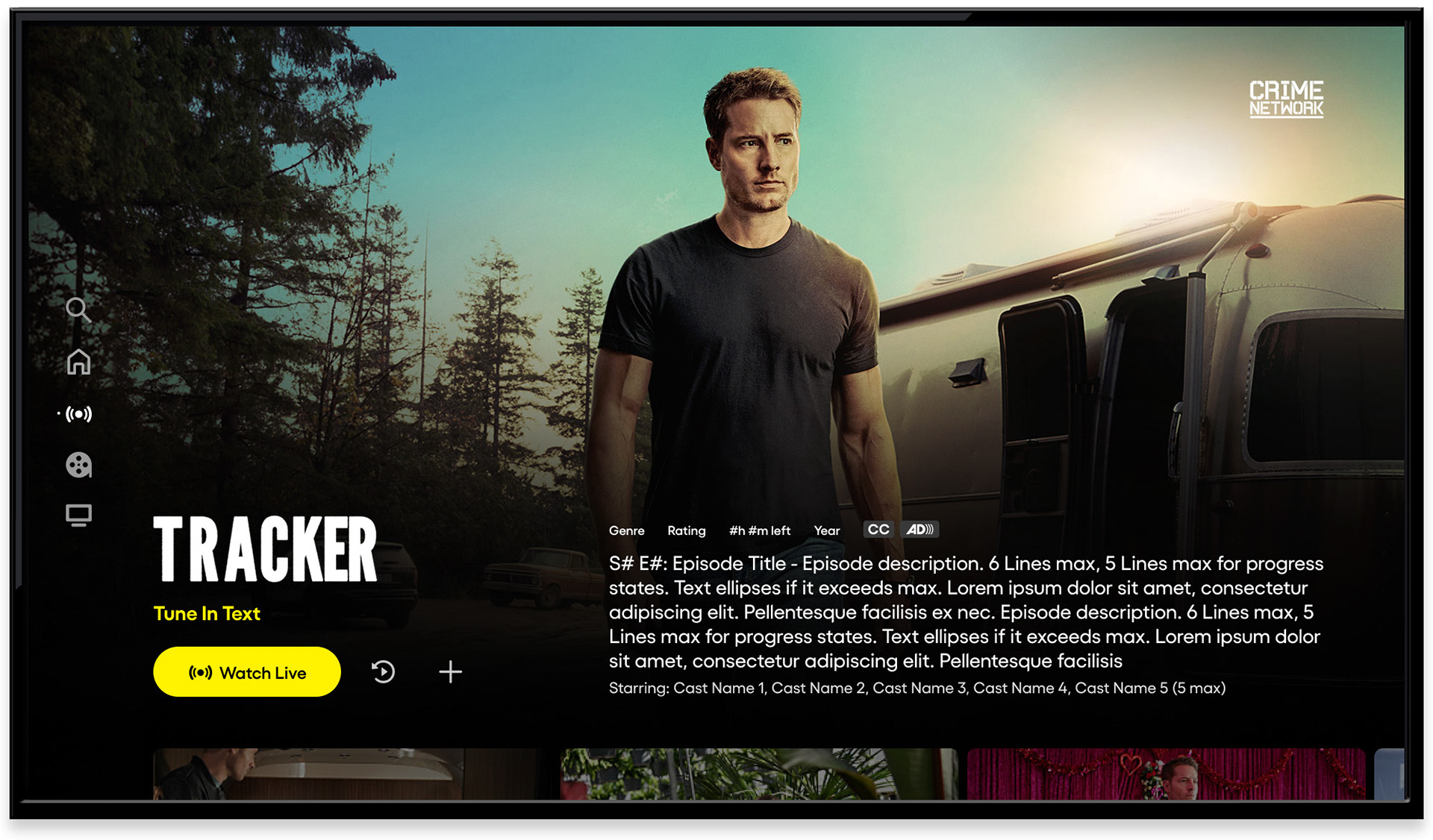
Channel guide - CTV, default view with live player
Live TV is central to what makes Pluto TV distinct. The channel guide was redesigned to honor that - giving users a clear, browsable view of what's on now, next, and later across hundreds of channels. A full-screen video player ran behind the guide, keeping the current channel visible while users explored. Focus state, metadata, and synopsis appeared together without requiring additional input.
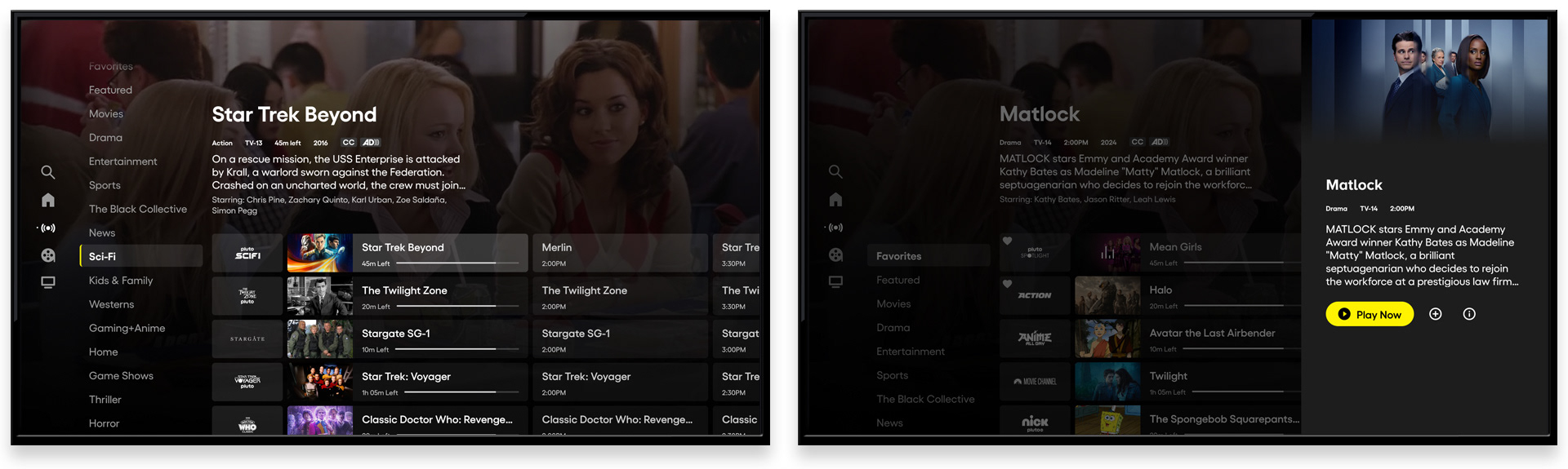
Channel guide - category navigation and side panel
Category navigation along the left edge of the guide let users bypass the full channel grid and jump directly to genres - Sci-Fi, Comedy, News, and more - reducing the discovery overhead for viewers who knew what they were in the mood for. Content available on demand or airing in the future opened a side panel with additional actions: watch list, play from start, upcoming airings. Browse and commit, without leaving the guide.
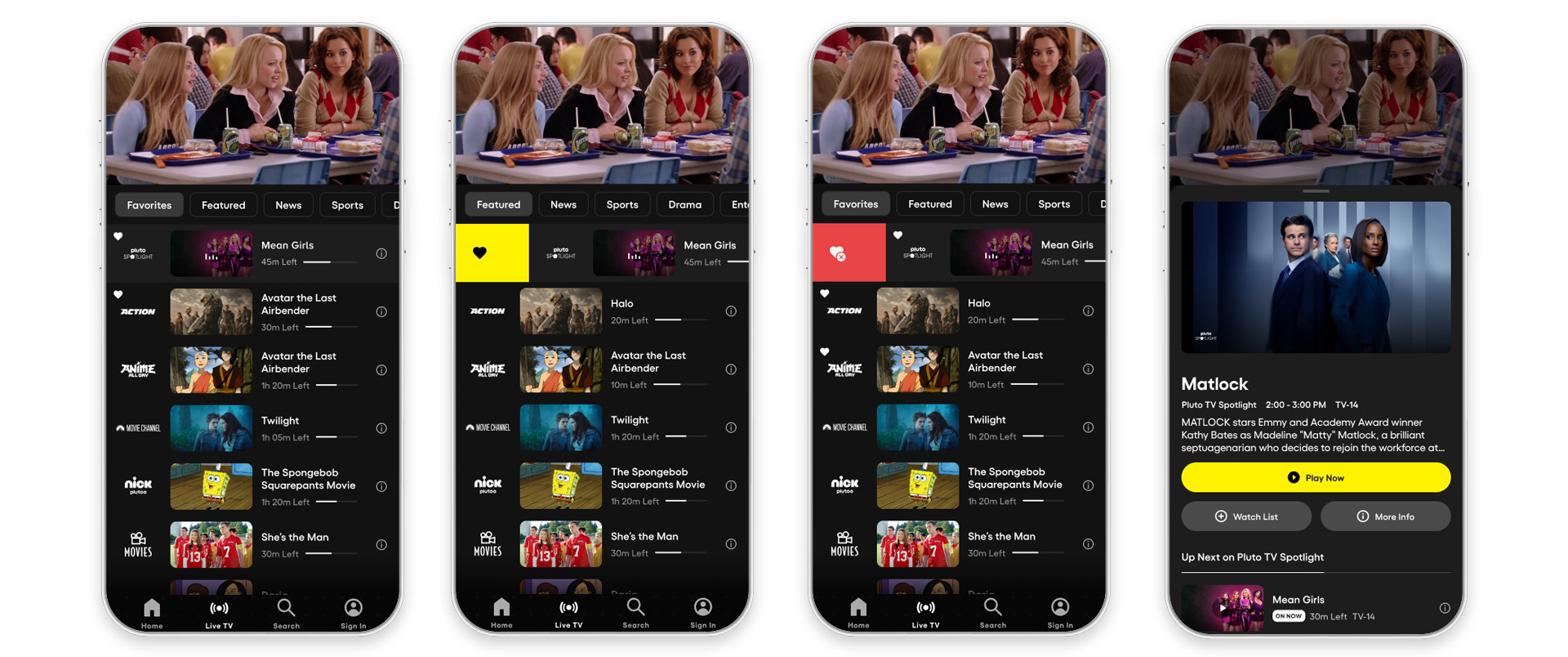
Channel guide - mobile, "On Now" with swipe to favorite
The mobile channel guide was rebuilt around the natural gestures of the surface. A swipe right favorited a channel instantly; a tap on a show opened a bottom sheet with details, watch list options, and upcoming episodes. The interactions were designed for one hand, one glance - matching how people actually use their phones while watching TV.
Movies and Shows Experience
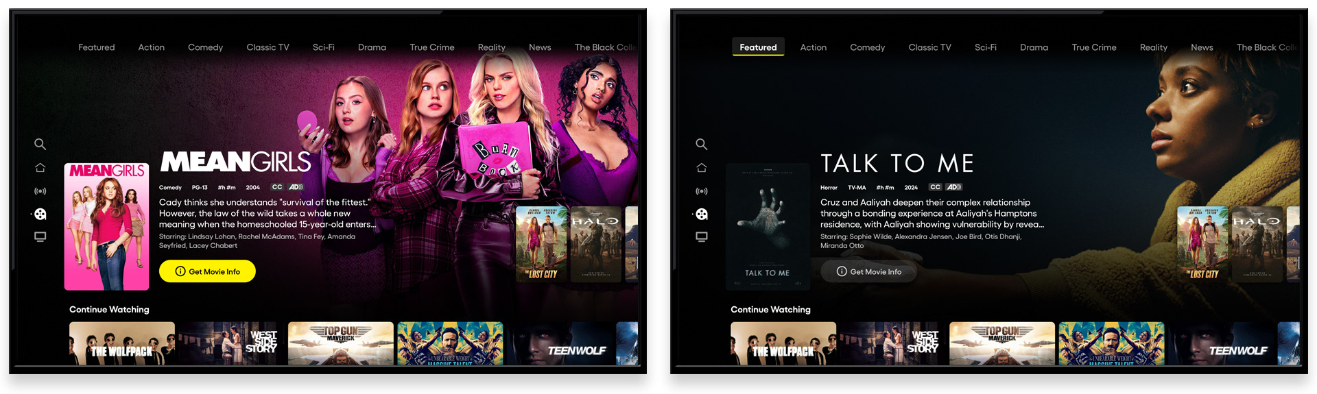
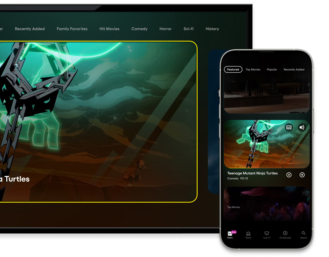
Movies and Shows - separated sections with category nav
One of the most consequential structural changes in the redesign was the separation of Movies and Shows into distinct sections. Previously combined, the split gave each content type room to breathe - and gave users a clearer mental model for where to go. Category navigation at the top of each section enabled genre filtering; a "Continue Watching" row kept in-progress content immediately accessible.
Content discovery - personalized and curated carousels
Across the discovery experience, personalized, popular, and editorially curated content appeared in context. Signals like "Top TV Shows" connected individual viewers to the broader audience - a subtle but effective mechanism for surfacing content that felt both relevant and socially validated.
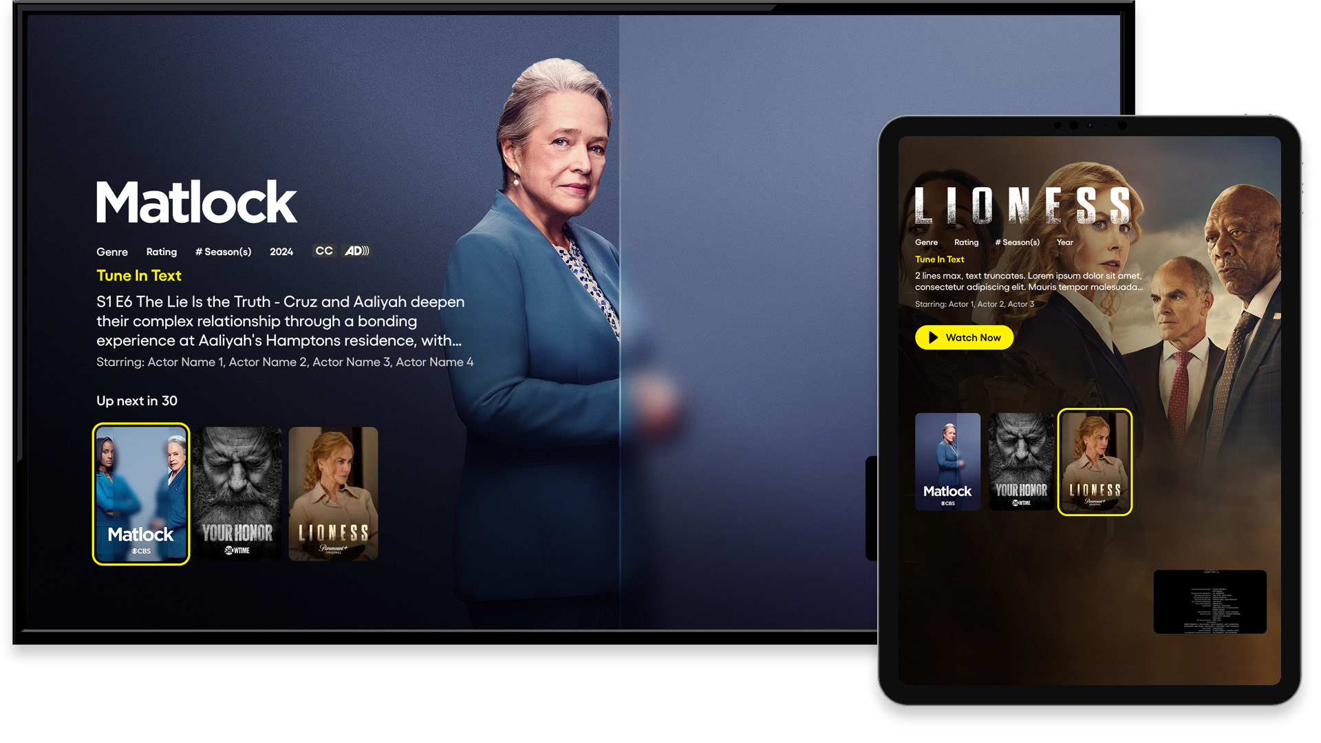
Content Details
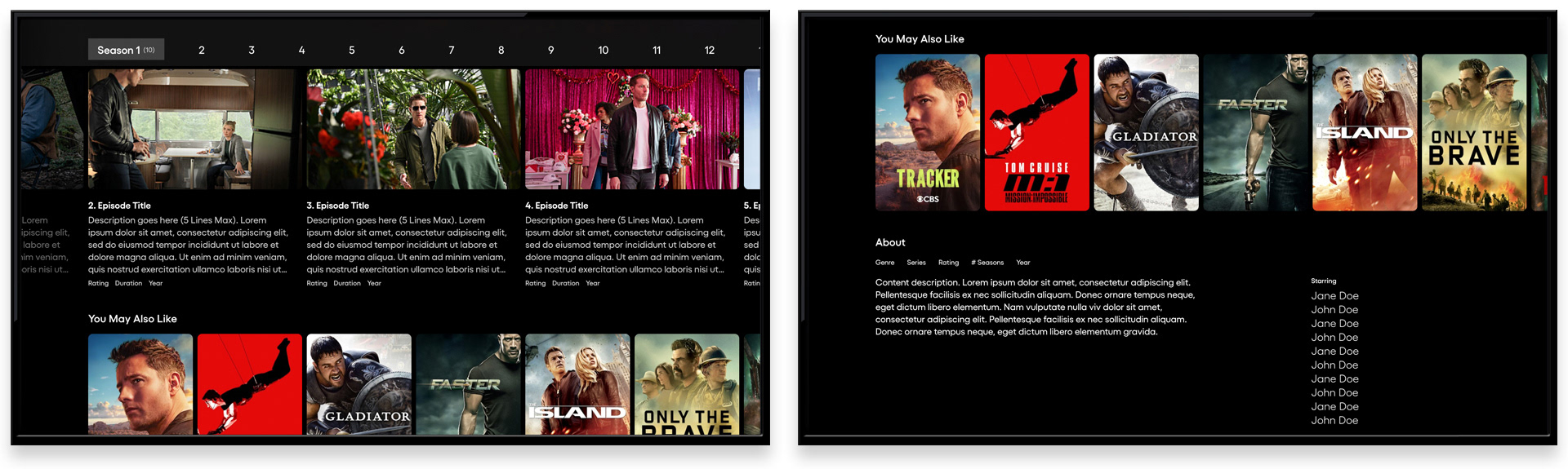
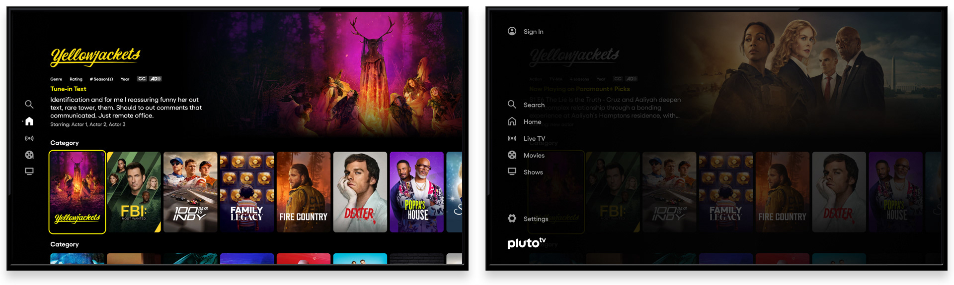
Content detail screens - series and movie, CTV
The content detail screens were rebuilt from the ground up. Full-bleed artwork established a premium visual context; metadata, synopsis, and a primary CTA delivered everything a viewer needed to decide and act. Content hinting at the bottom of the screen - seasons and episodes, similar titles, additional details - signaled depth without front-loading it. The result was a detail experience that felt decisive rather than overwhelming.
Player Experience
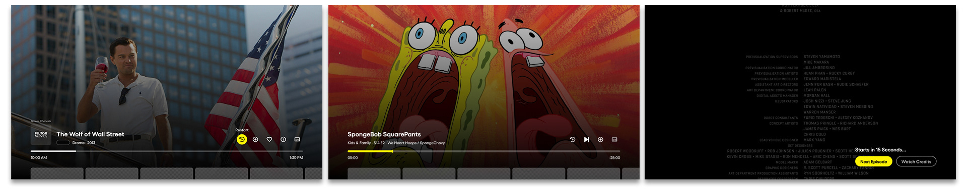
Player controls for Live and VOD content. Skip to next episode feature on far right
Player controls were simplified and unified across content types for the first time. Live TV and VOD shared a consistent interaction model, with contextual actions - restart, watch list, channel favorite - available without cluttering the default playback state. A "Next Episode" feature let viewers skip credits and continue watching with a single input, reducing drop-off at the natural end of each piece of content.
Live TV player controls. Mini-Guide channel browsing. Content discovery tray
The live TV player introduced a mini-guide for in-player channel browsing and a content discovery tray accessible from the player itself - keeping viewers inside the experience rather than navigating back through the app. The tray surfaced content relevant to what was currently playing, extending session time by meeting discovery intent at the moment it arose.
End Cards
End cards - multiple next-watch suggestions
End cards presented personalized recommendations at the natural conclusion of each piece of content - the highest-intent moment in the viewing session. Multiple suggestions gave users options without forcing a choice; the option to let credits roll respected the viewer who wasn't ready to move on. Both paths were deliberate.
Search Experience
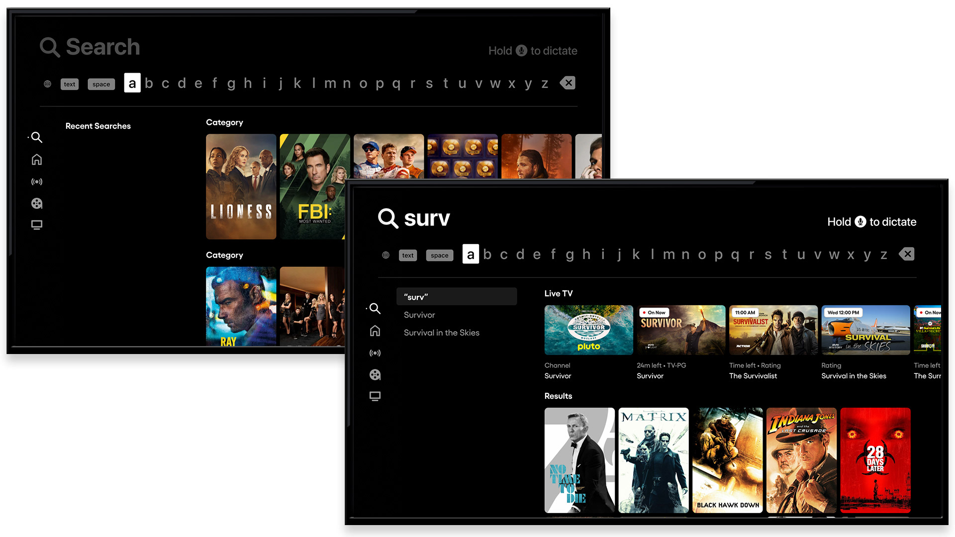
Search - Apple TV, suggestive results with live TV row
The redesigned search experience surfaced recent searches immediately, reducing re-entry friction for repeat queries. Suggestive search activated as users typed, delivering results before the query was complete. Critically, a dedicated Live TV row within search results - surfacing matching channels and live airings - connected on-demand search intent to Pluto's most distinctive feature, keeping live content visible and discoverable even in a search context.
Registration
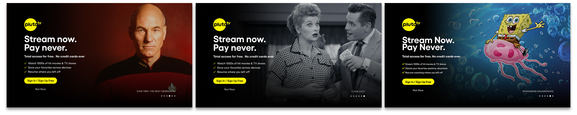
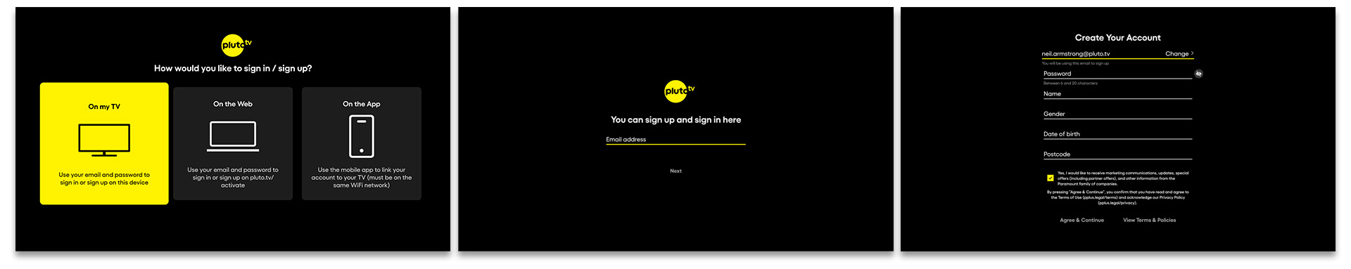
Registration walls and sign-in/create account flow
Registration walls were placed with precision, surfaced at moments in the experience where their value was most apparent and the user's motivation to act was highest. Each wall communicated the specific benefit of signing in or creating an account, framing registration as an unlock rather than a gate. The flow itself was kept lean: clear options, minimal steps, and a value exchange that worked for the viewer and the business equally.