STREAMING: LIVING ROOM EXPERIENCE
A Unified Streaming Foundation
The living room had become a fragmentation problem. Seven platforms: Apple TV, Roku, Android TV, Amazon Fire TV, PlayStation 4, Xbox One, and Samsung Tizen - each with its own technical requirements, each historically requiring its own design and development effort. Across four brands. Multiplied by every update, every feature, every release cycle.
The strategic answer was to stop designing for platforms and start designing for the experience. A unified TV Everywhere approach - one design system, one codebase, deployed across every connected TV platform simultaneously - collapsed that complexity into something manageable and scalable for A&E, HISTORY, Lifetime, and FYI.
This is the foundation of that living room experience: the UX design that shipped across all seven platforms from a single source of truth.
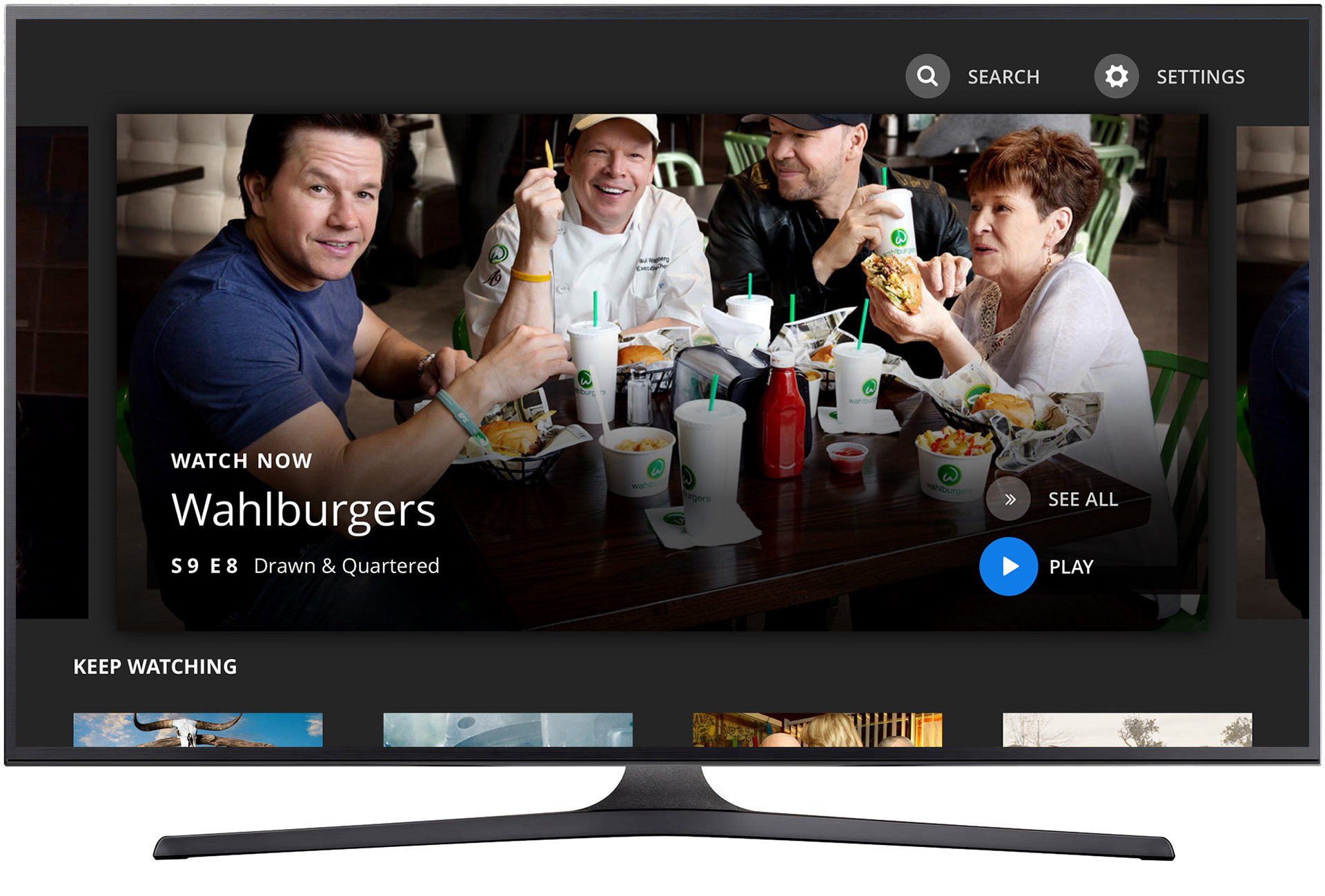
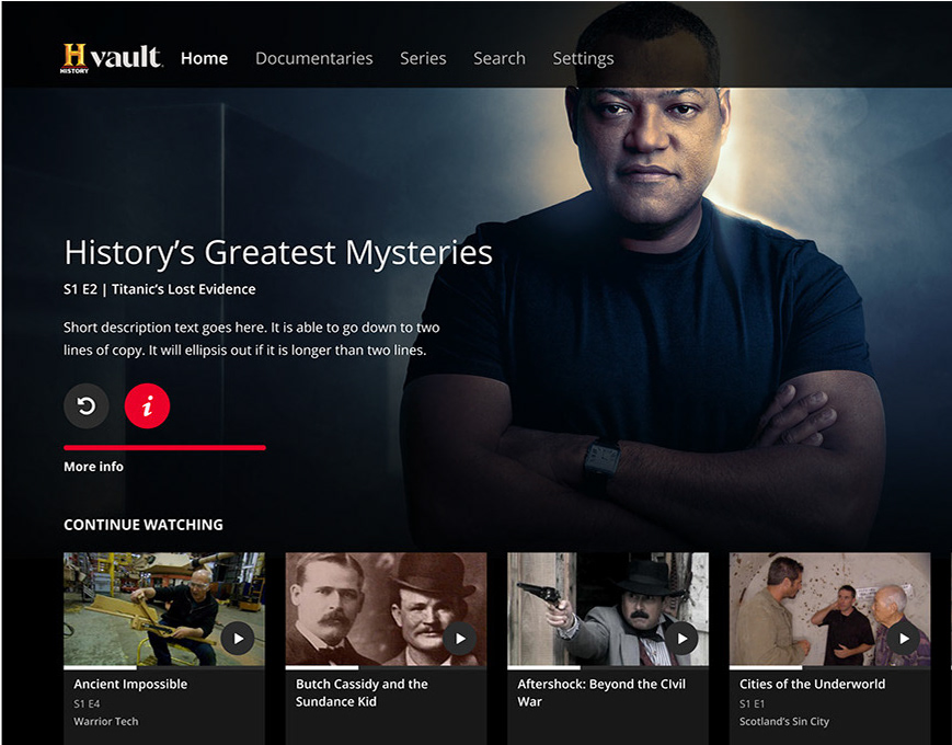
Home Screen - "Play" in focus
The home screen was designed around the primary intent of living room viewers: getting to content quickly. Full-bleed hero imagery anchored the experience, with a focused "Play" action as the default state, minimizing the number of remote inputs between landing on the app and watching something.
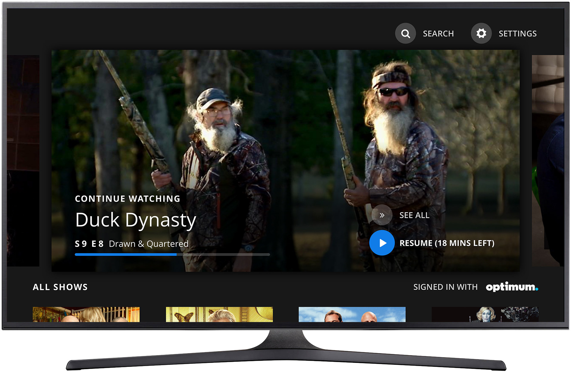
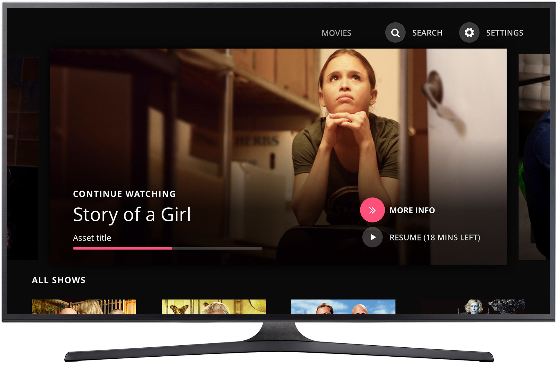
Home screen - "Resume" in focus
For returning viewers, the experience adapted immediately. "Resume" surfaced in focus for in-progress content, respecting where the user left off without requiring them to navigate back to it. The app remembered so the viewer didn't have to.

Home screen featuring a "Keep Watching" playlist and "All Shows" grid
Below the hero, the home screen organized content around two distinct viewer modes: the returning viewer picking up where they left off, and the browser looking for something new. "Keep Watching" served continuity; the "All Shows" grid served discovery. Both lived on the same screen without competing for attention.
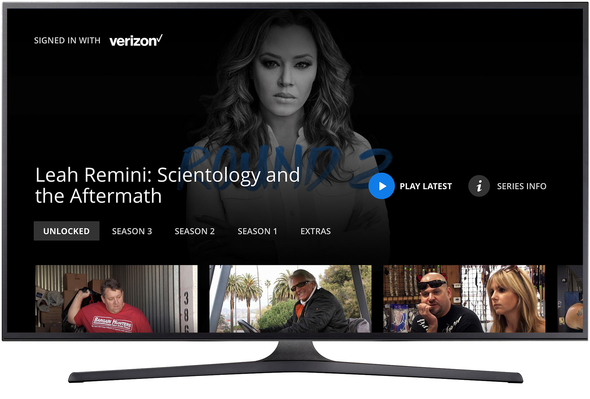
Series landing screen - "Play Latest" in focus
Series landing screens led with the most contextually relevant action - "Play Latest" -and provided season and episode navigation for viewers who wanted more control. The hierarchy was designed for the remote: the most common action required the fewest inputs.
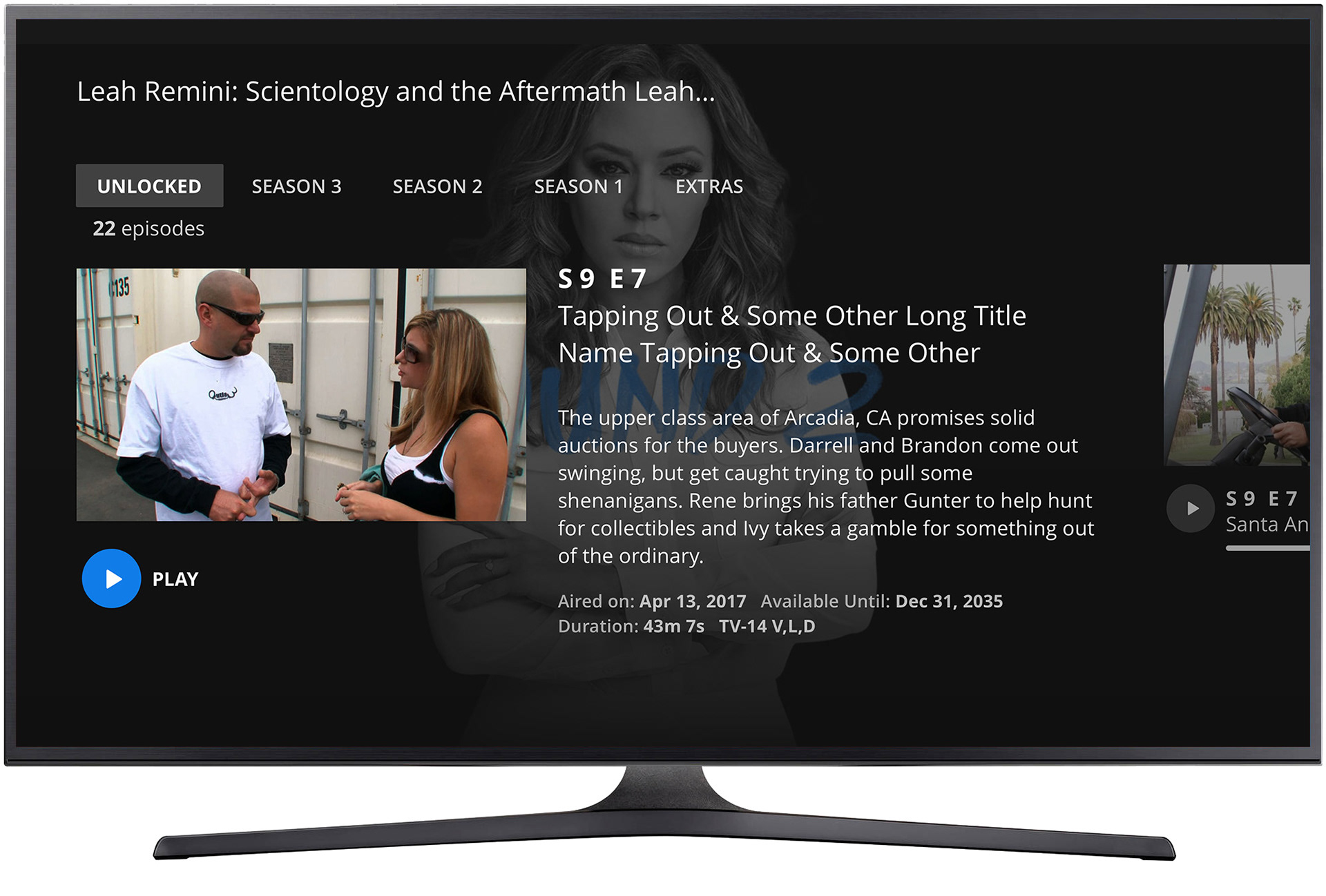
Episode detail screen - "Play" in focus
Episode detail screens balanced metadata with immediacy. Title, synopsis, and episode information were visible at a glance; the primary action stayed front and center. On a 10-foot display navigated by remote, every extra step is friction, the layout was designed to eliminate it.
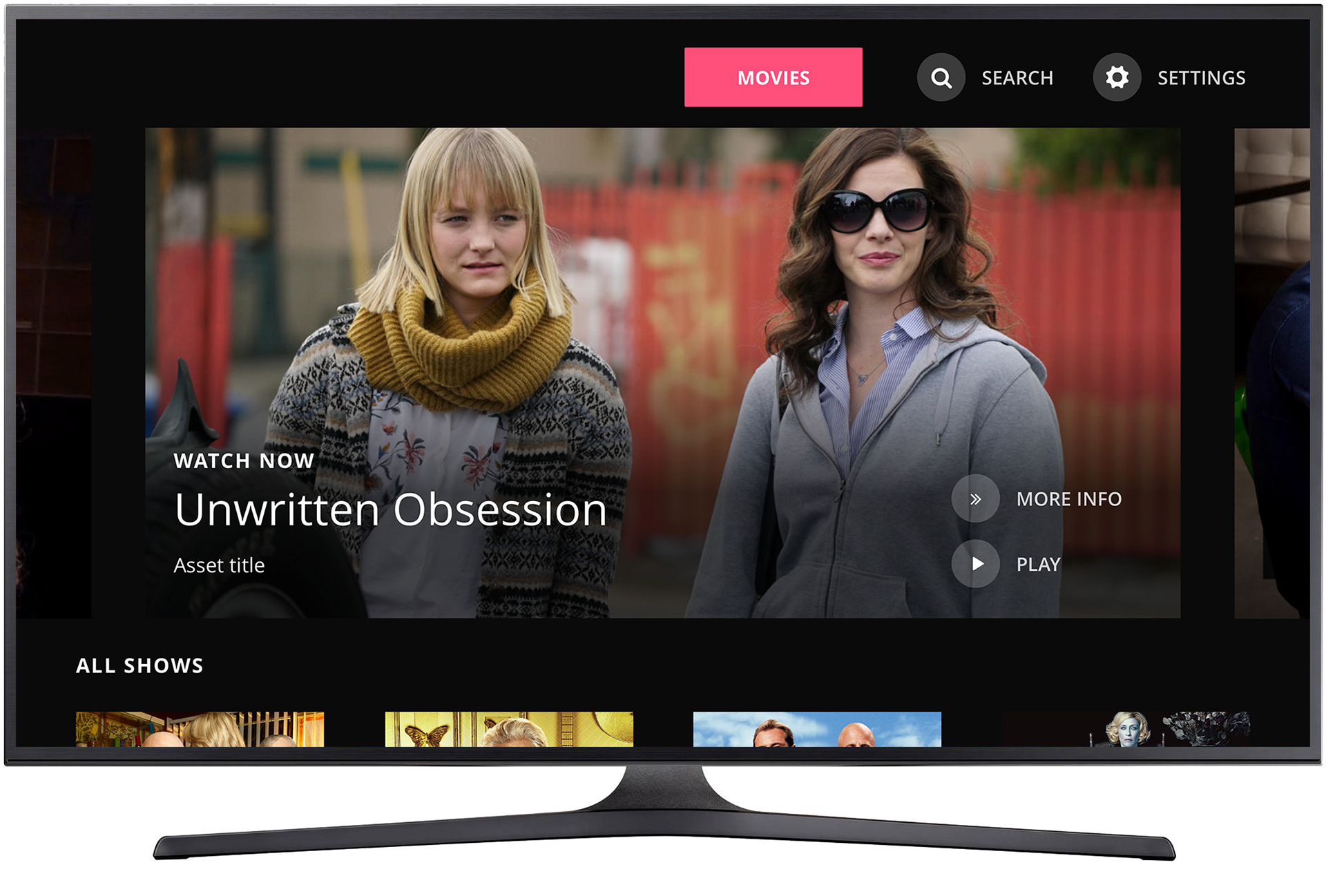
Home screen - "Movies" in focus (which is unique to Lifetime)
Lifetime's content mix required a distinct treatment. The "Movies" section, unique to the Lifetime app, was surfaced as a primary navigation destination, reflecting the brand's identity as a destination for original movies and the viewing habits of its audience. One system, purposefully adapted.
Home screen - "More Info" in focus
"More Info" gave viewers a path to content context without committing to playback. The action revealed metadata, synopsis, and related content - keeping the experience informative without interrupting the browsing flow or requiring navigation away from the home screen.
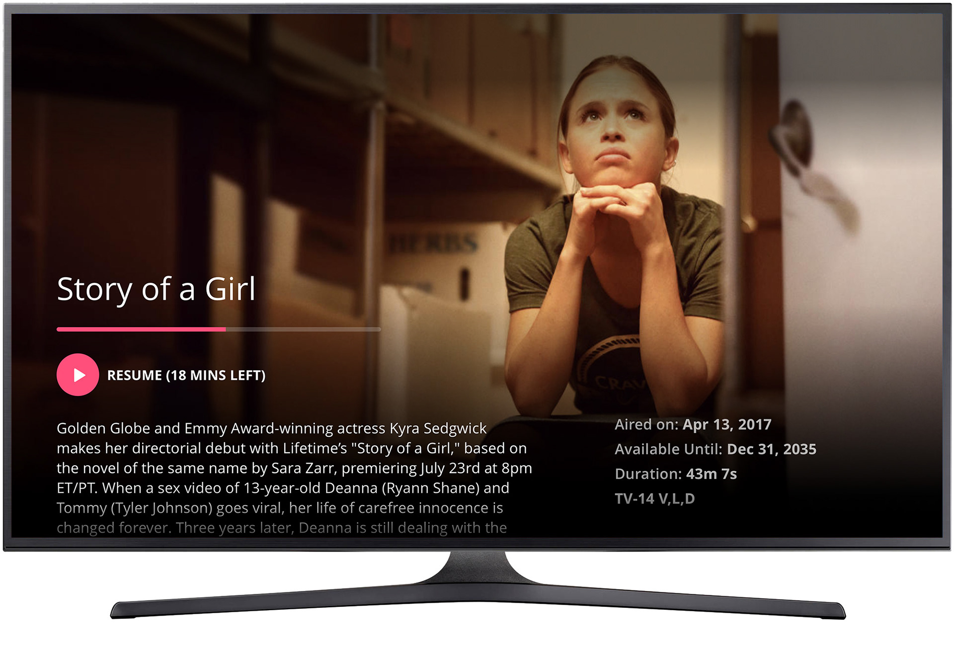
Movie detail screens - "Resume" in focus. Synopsis displayed
Movie detail screens surfaced the synopsis and primary actions together, with viewing state reflected in the CTA. "Resume" appeared in place of "Play" for in-progress movies, a small but meaningful signal that the app understood where the viewer was.
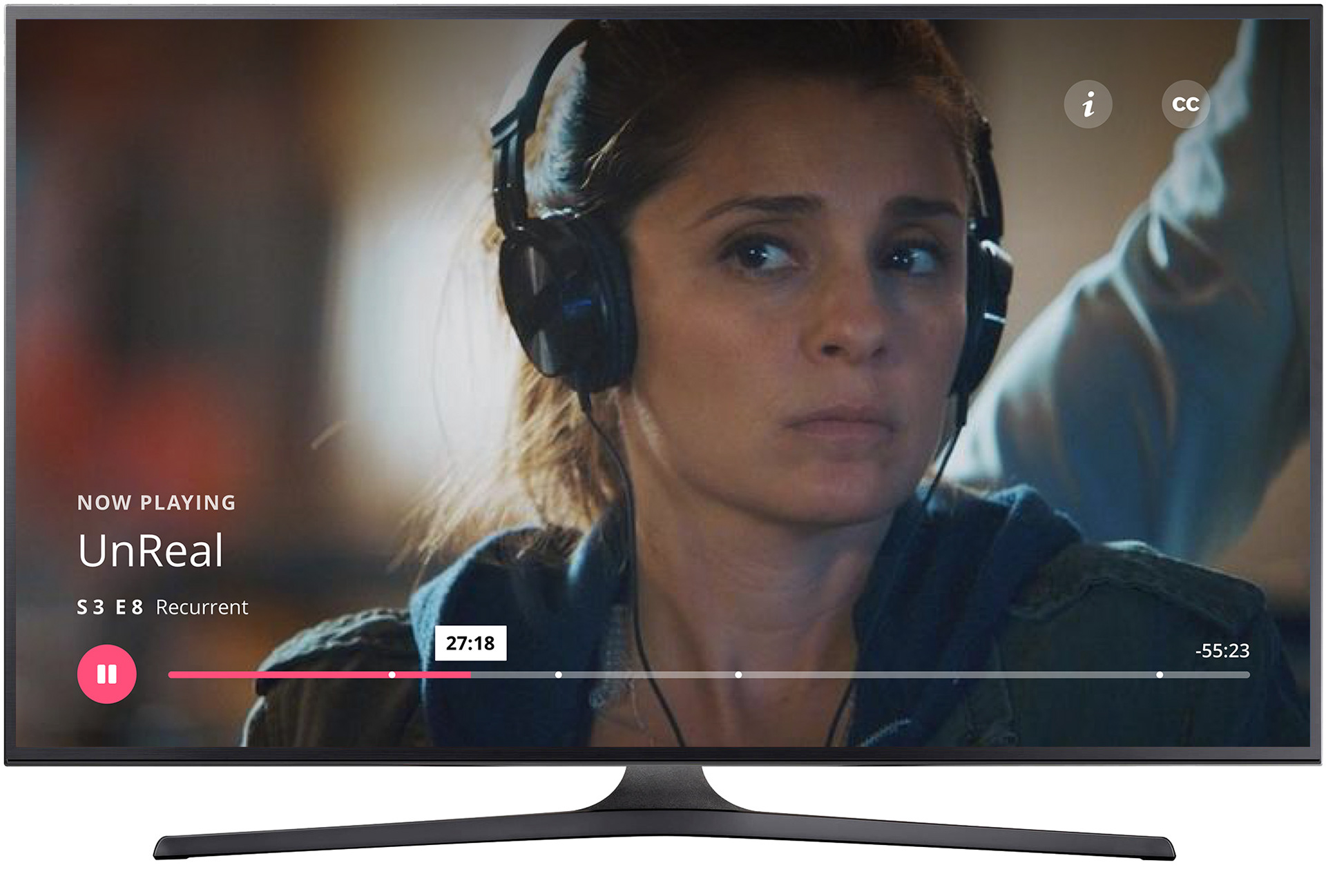
Video player with controls displayed
The player was built for the remote. Playback controls appeared on demand and stepped back when not needed, keeping the full-screen content experience clean. Progress, scrubbing, and navigation were all accessible without requiring the viewer to leave the player context.

Video player with "Up Next" displayed
As content approached its end, "Up Next" surfaced with the following episode, giving viewers a frictionless path forward as the credits began to roll. Autoplay was supported; so was the choice to stay. The feature was designed to serve the viewer's momentum, not override it.
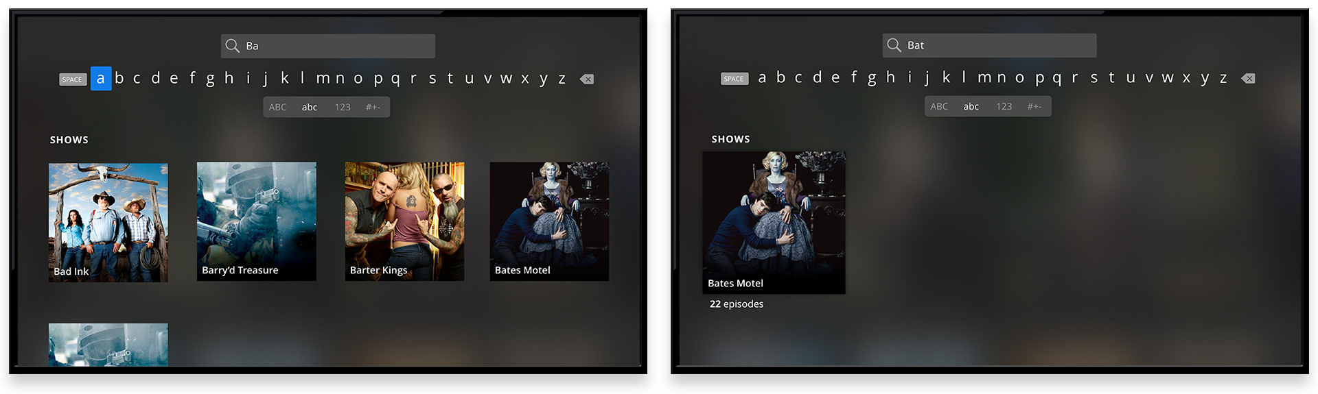
Search - real-time filtered results.
Search results filtered in real time as users typed, narrowing the visible content set with each character entered. On CTV, where keyboard input carries real cost, reducing the number of keystrokes needed to reach a result was a meaningful UX investment. A focused result previewed as the query tightened, giving users a clear signal they were heading somewhere useful.