STREAMING: LIVING ROOM, MOBILE, WEB DEVICES
Subscription Video On Demand: Unified Apps
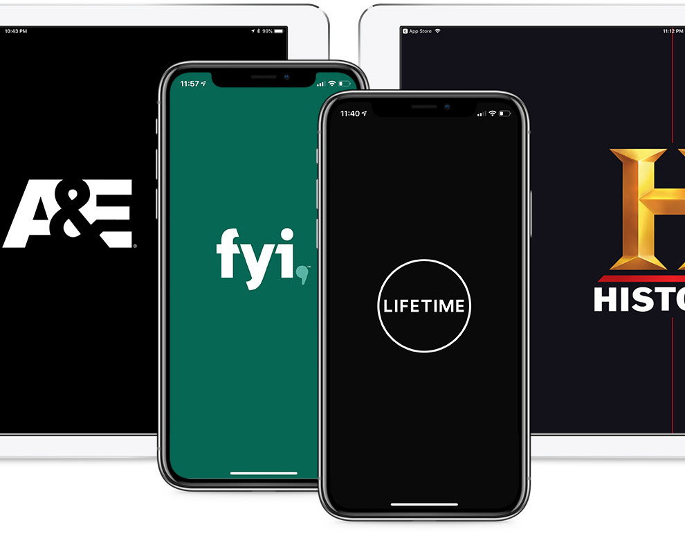
A+E Global Media had never shipped a subscription video product. So this was a zero-to-one project - three times. Lifetime Movie Club was the first, a library-first experience built for dedicated fans of Lifetime originals, conceived and designed from the ground up. HISTORY Vault followed, introducing new complexity: a broader content mix of documentaries and series, and a meaningfully different audience.
When A&E Crime Central entered the picture, it became clear the organization needed more than a good product design. It needed a system. The strategic decision: build a unified design system rather than design each product in isolation. It became the foundation for the entire A+E streaming portfolio.
Home Experience
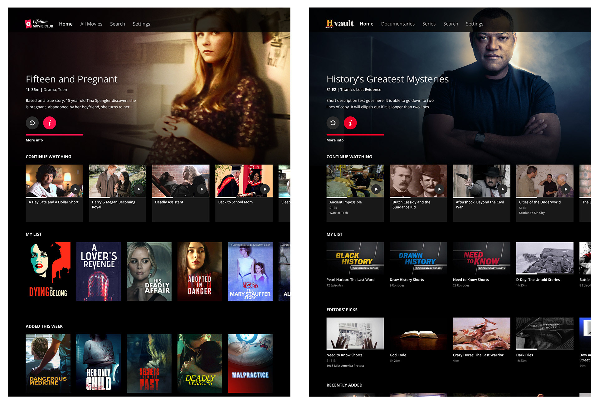
Home screen experiences across Lifetime Movie Club, HISTORY Vault, and A&E Crime Central on connected TV
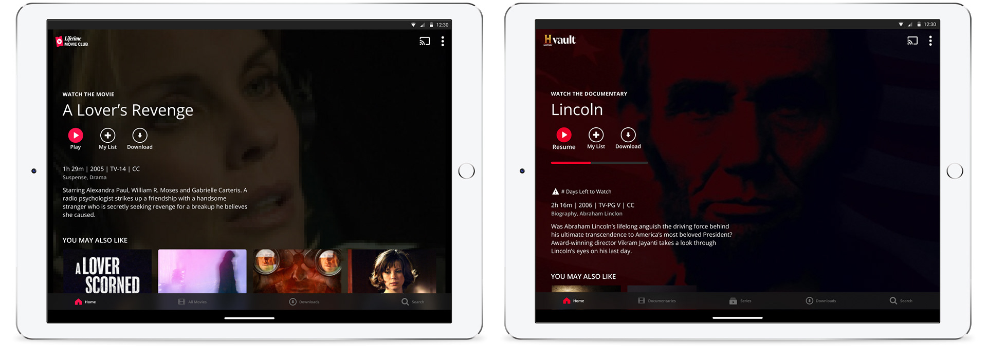
Each app had distinct content, a distinct brand, and a distinct user. But beneath those differences, the experiences shared far more structural and functional DNA than they diverged. The challenge was to honor each brand while eliminating the redundancy that was slowing teams down and introducing inconsistency across the portfolio.
A unified design system allowed each product to feel distinctly branded while operating from the same underlying components and patterns. The design work was done up front, components were unified across the board, variants were added where necessary.
The same system translated across every screen size, from a 75" living room television to a 4" phone. Brand identity was applied as a layer on top of shared structure.
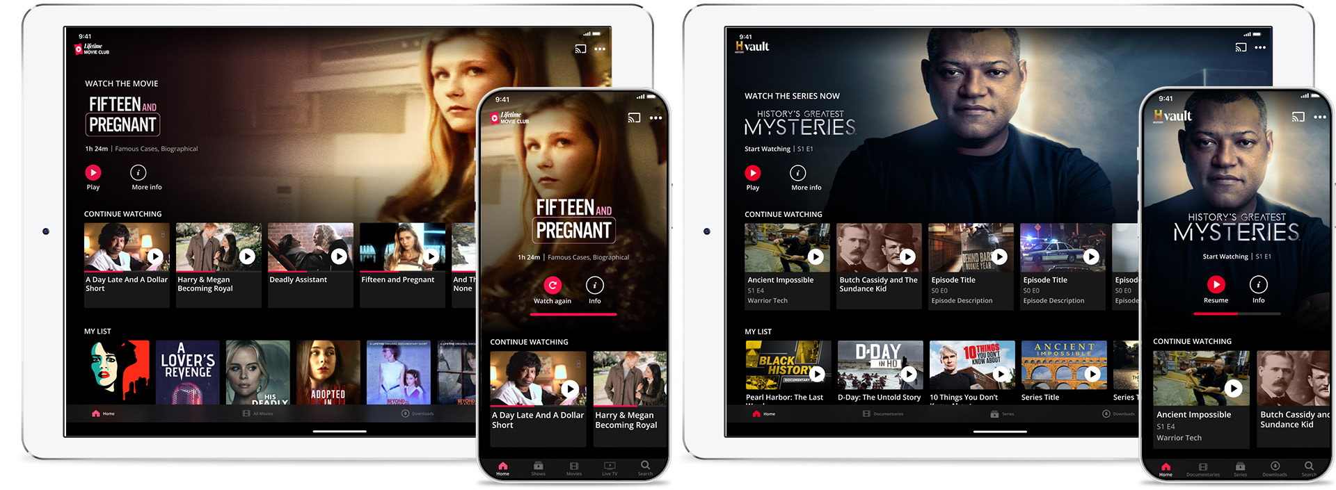
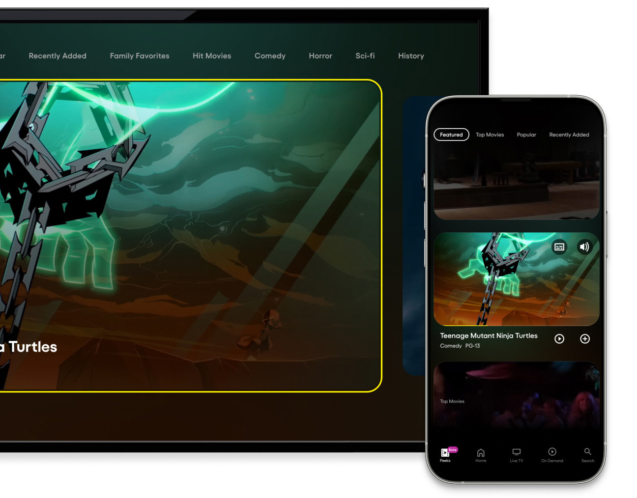
Home screens - mobile and tablet
Onboarding: reducing friction at the moment of commitment
The onboarding flow was designed to reduce friction at the moment of commitment. On CTV, where typing is inherently cumbersome, a QR code handoff let users complete purchase or account creation on their phone, keeping the living room experience fluid from the first interaction.

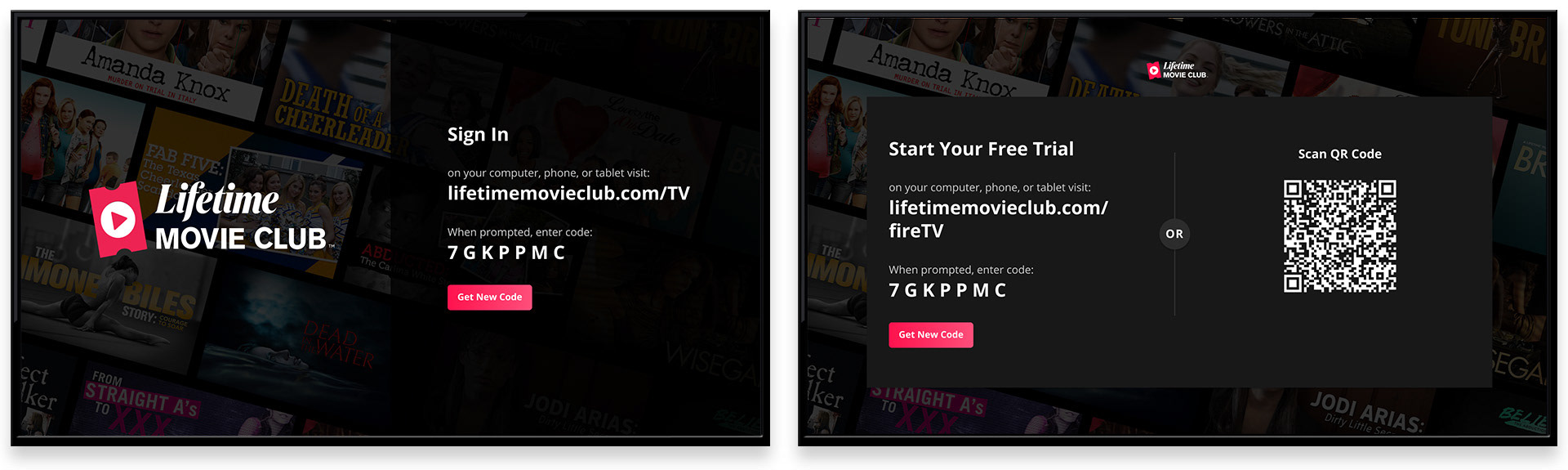

Purchase and Sign In/Create Account flow - CTV
Navigation
Navigation architecture balanced breadth with clarity. A consistent global structure gave users orientation across all content types, while tabbed secondary navigation let them narrow quickly by genre, subject, or series type - reducing the steps between intent and content.

Global navigation - A&E Crime Central,Shows index. Secondary tabbed navigation - HISTORY Vault
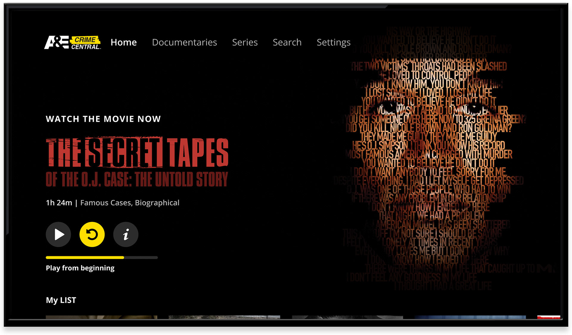
Series Detail Screen
CTV led with the primary actions most users needed: Play, Add to Watch List, and More Info. Season and episode navigation ran horizontally, keeping metadata and synopsis visible without requiring additional input.

Series detail screen - CTV
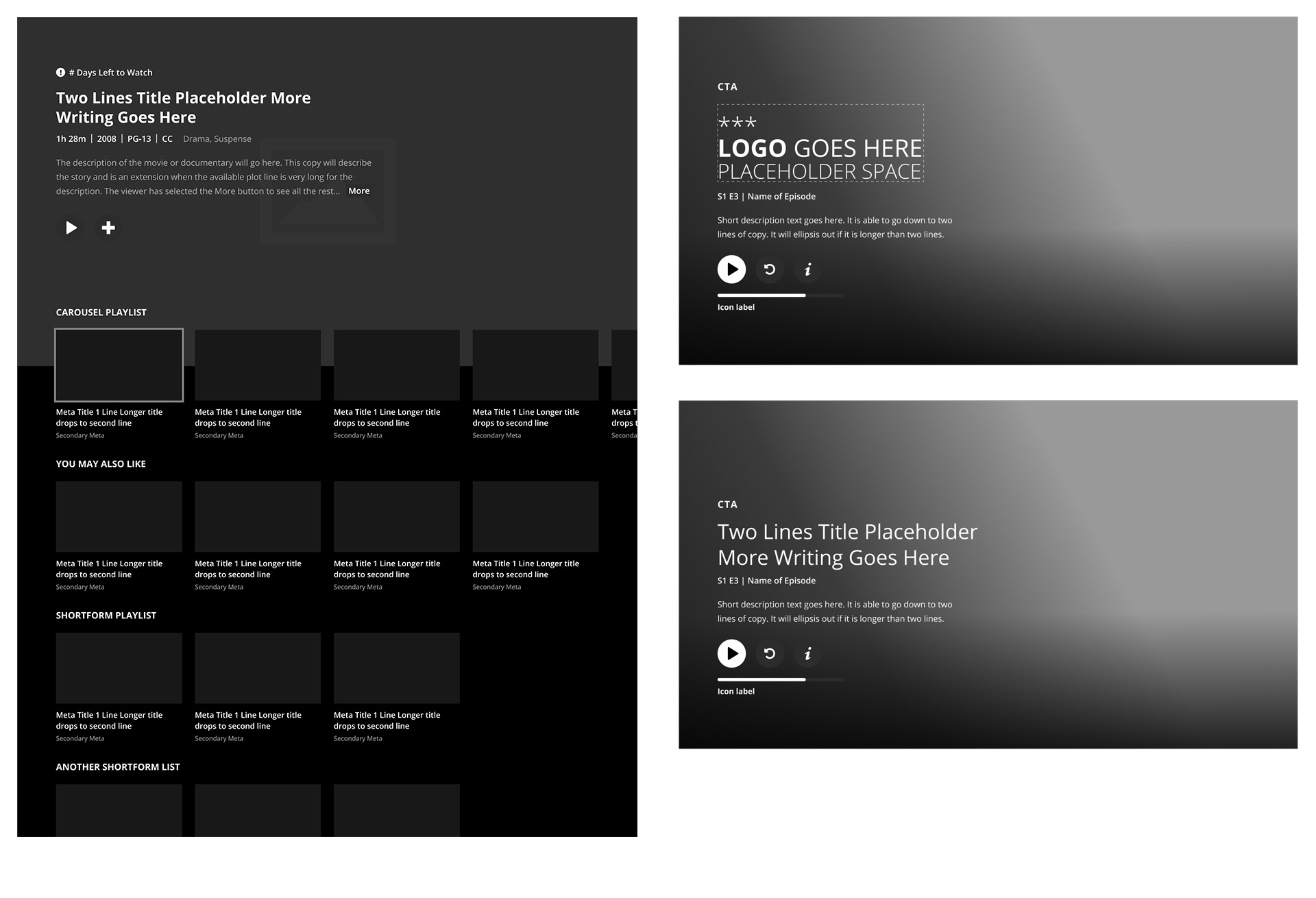
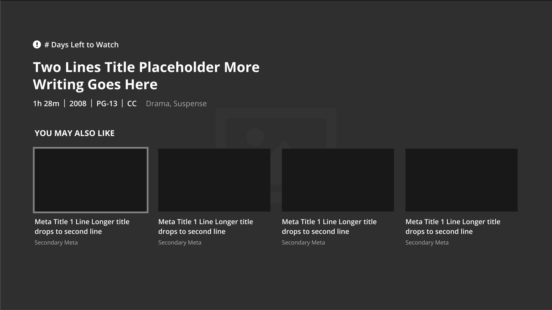
Content Detail Screens
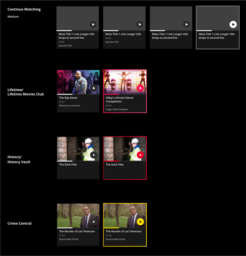
This experience adapted to each user's viewing state. "Resume" and "Replay" replaced "Play" based on progress. Expiration warnings surfaced inline. Downloads enabled offline viewing on mobile and tablet. A "You May Also Like" carousel kept discovery moving forward across every surface.

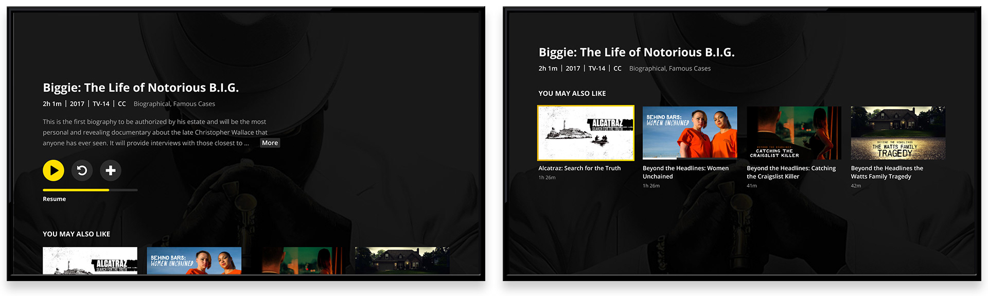
Content detail - mobile, tablet, and CTV
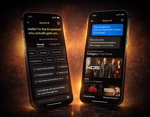
Search
Suggestive search offered real-time query suggestions as users typed. On the living room experience, where every keystroke has a cost, reducing input friction measurably shortened the path from intent to content.
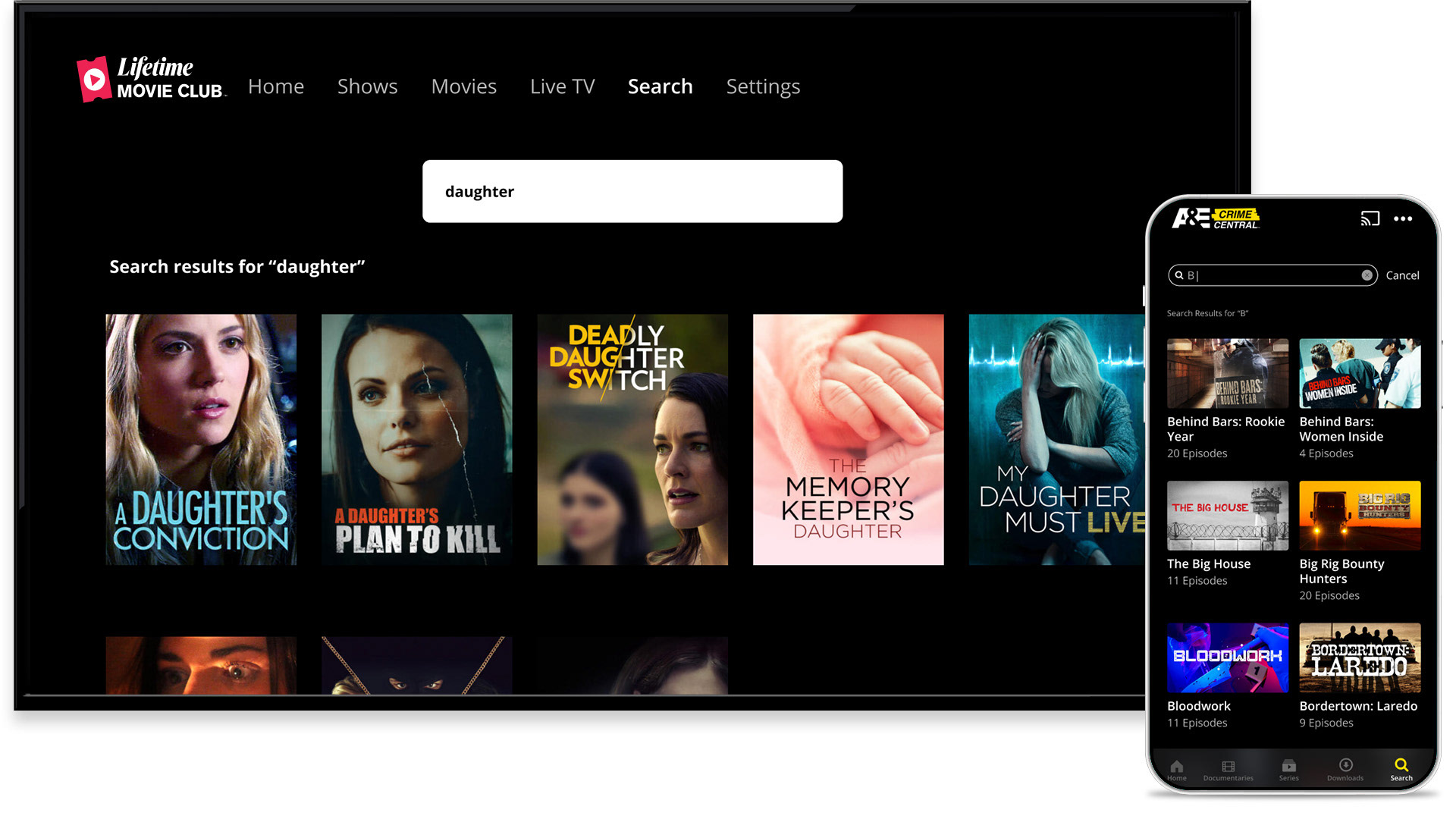
Search - CTV and mobile devices
Full-Screen Player
The player was designed to stay out of the way. Controls appeared on demand; the experience defaulted to content. A progress bar and fast-forward scrubbing gave users precise control without cluttering the full-screen view.
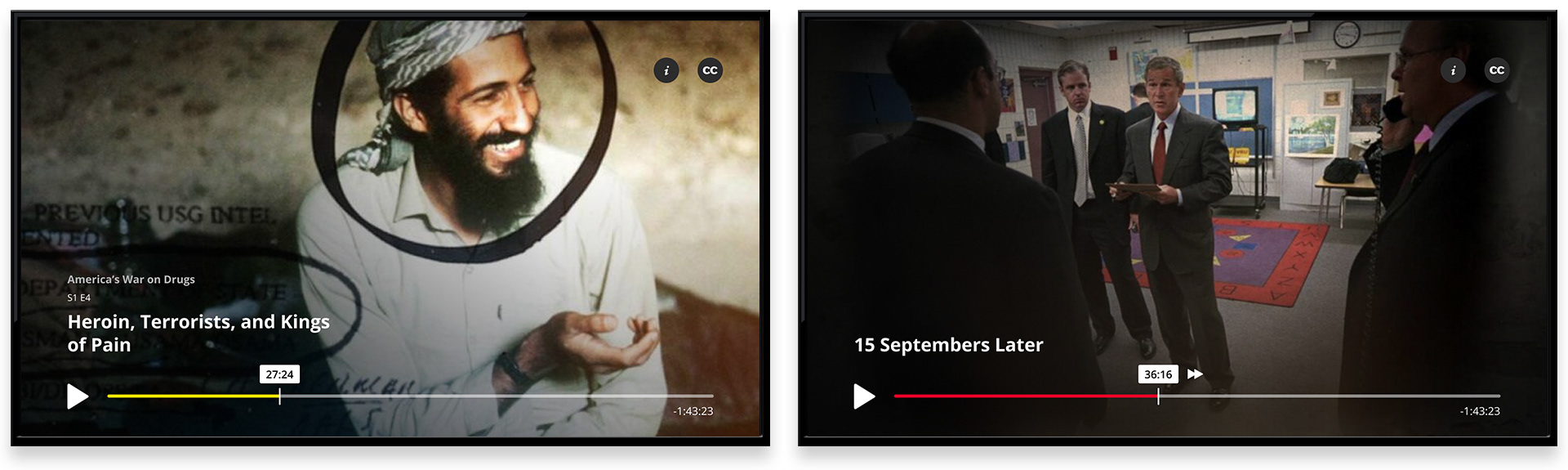
Full screen player - progress bar and scrubbing
On CTV, pressing up on the remote surfaced the Info action. Selecting it revealed content metadata and description without interrupting playback - keeping the experience lean and navigable by remote.

Full screen player - info overlay
The "Up Next" feature activated as end credits began to roll, giving users a clear, timely path to the next episode without forcing a decision. Binge viewing was supported without being presumed.
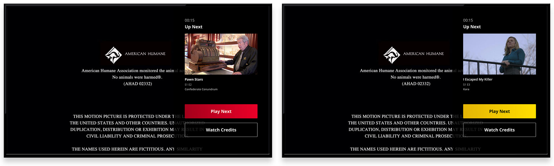
Full screen player "Up Next"
Settings
Settings rarely earn attention, but they define trust. Profile management, account controls, accessibility settings, and subscription management were designed to be easy to find and straightforward to use - reducing friction at moments that often drive churn.
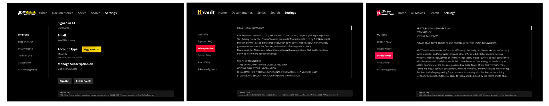
Settings across brands
Establishing the Design System
A design system was the only way to deliver consistency and efficiency across three products, three brand identities, and every platform from living room to pocket. The system was built to scale - components designed once, variants applied per brand, templates reused across products and teams.
Brand colors, logos, gradients, and neutral palettes were the logical foundation. Establishing tokens at this level meant every downstream decision (navigation, cards, player UI) could inherit brand identity without being rebuilt for each product.

Brand tokens - color, logo, gradient, neutrals
Logos, colors, and typography were applied across a unified global navigation pattern for CTV. One scalable solution, three distinct expressions.
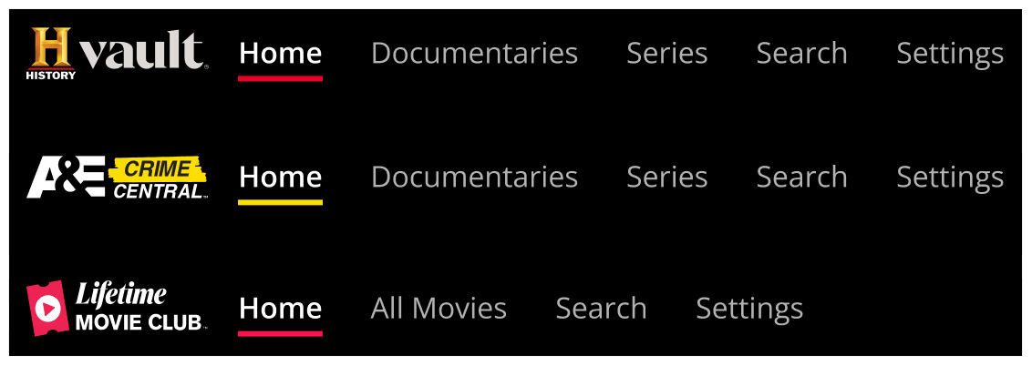
Global CTV navigation - brand styles applied
Mobile navigation shared icon and nomenclature conventions across all three products, reducing cognitive overhead for users who moved between apps, and development overhead for teams who shipped them.
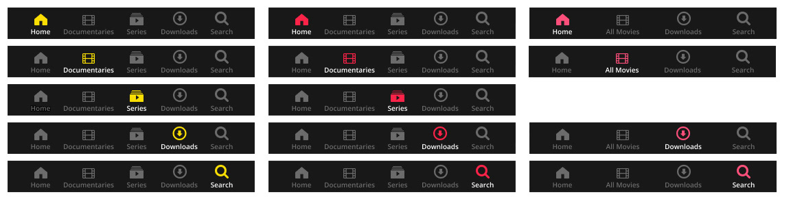
Mobile navigation - unified icons and labels
Unifying card components meant aligning focus states, play icons, progress bars, and metadata placement across the portfolio. Brand color was a property of the component - not a reason to rebuild it.
The same card architecture scaled to every device size. Mobile and tablet episodic cards with brand color variants applied - the same component, the same logic, a different brand layer on top.
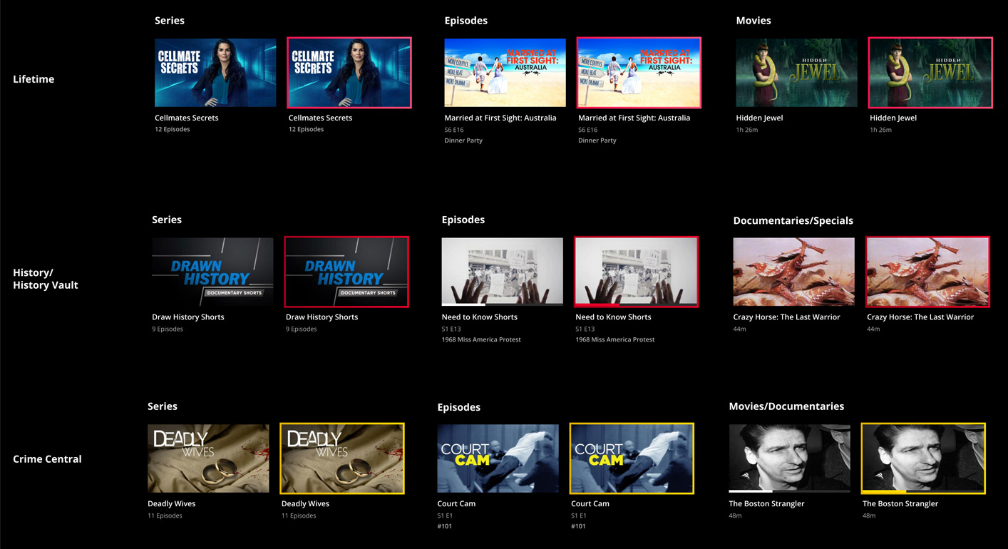
CTV examples above with focus state and brand treatments applied

Card components - mobile and tablet, episodic
Templates
Unifying templates and layout patterns gave the components a home. Every part was interchangeable, movable, and reusable, creating the structural consistency that made it possible for design and development teams to move faster across products without diverging.
Page templates and layout scaffolding
The system built for three SVOD products became the design infrastructure for A+E's entire streaming portfolio, extending to apps across A&E, HISTORY, Lifetime, and FYI. What started as a scalability decision became a long-term organizational asset: a foundation that enabled new products to ship faster, look coherent, and feel considered across every brand and every screen.
If you scrolled this far, here is a fun bonus for you... One of the first promos ever made for Lifetime Movie Club