EDITORIAL WEB
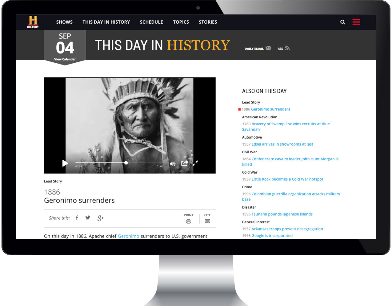
History Stories
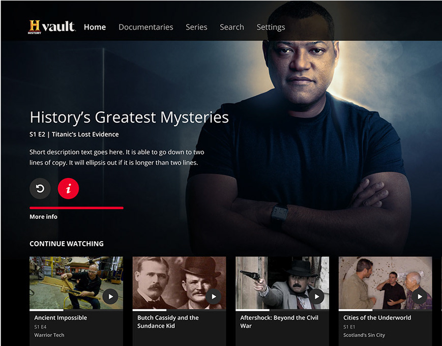
The HISTORY brand has never had a depth problem. Decades of stories spanning wars, discoveries, movements, and figures that shaped civilization, all competing for attention on a web experience that wasn't built to show any of it off.
The complete redesign of the HISTORY Stories web experience started with a single editorial conviction: the writing and photography were strong enough to carry the experience on their own. The design's job was to get out of the way. That meant stripping out the visual noise, building a layout system anchored in generous negative space, and letting the photography lead - from landing page to article close. The result was a responsive editorial experience that felt less like a media company's content hub and more like a publication worth reading.
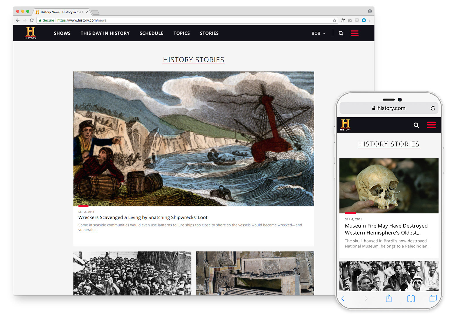
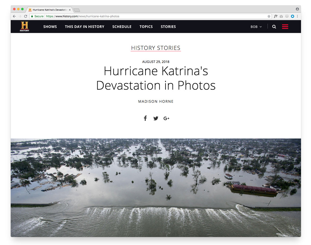
Stories landing page - Hero, responsive
The landing page opened with full-bleed photography and bold typographic treatment - an immediate signal that this was a reading destination, not a content directory. Visual browsing was the primary mode: story topics and headlines surfaced through imagery first, copy second, letting the photographs do the work of drawing readers in before they committed to a click.
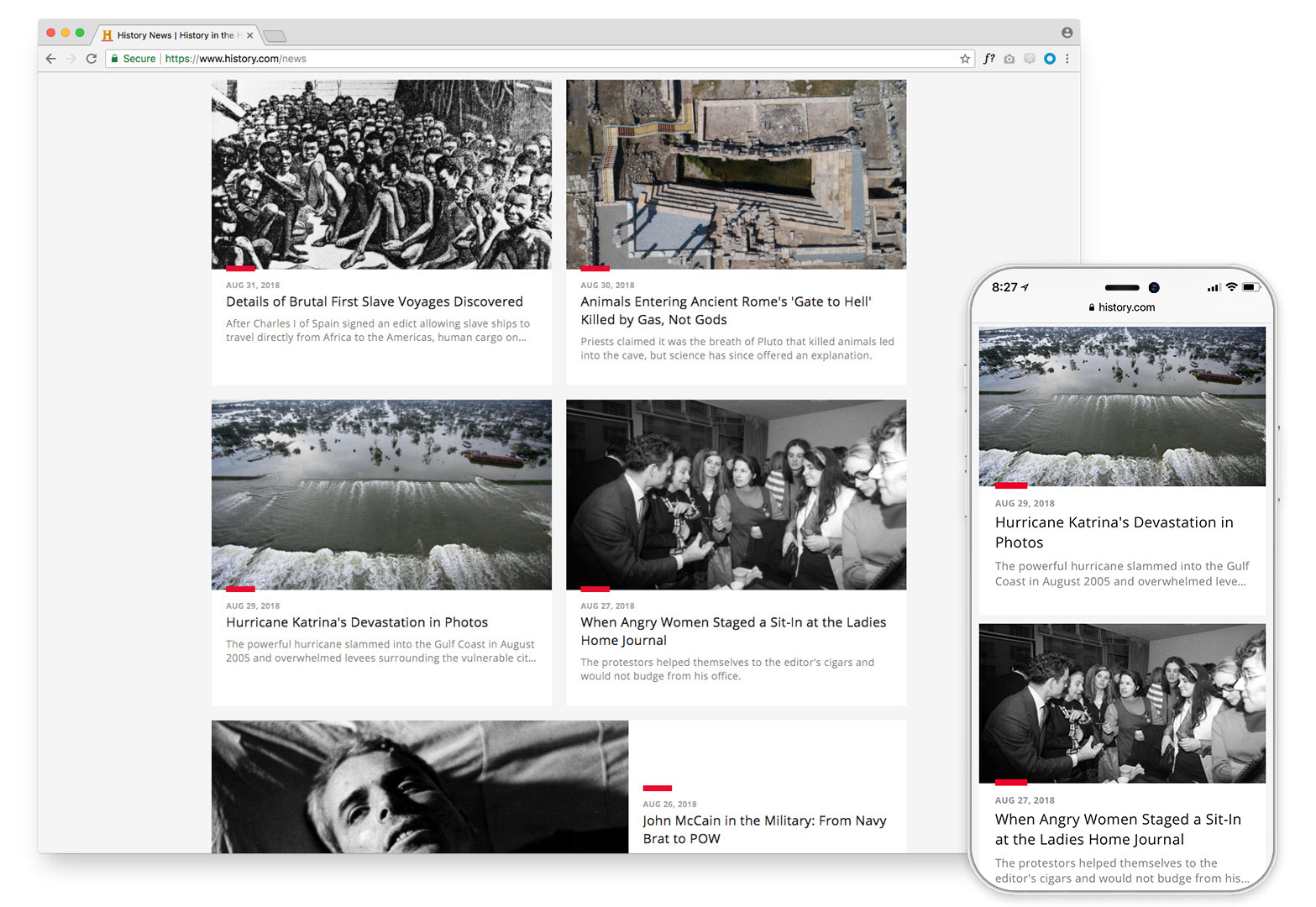
Stories landing page - card grid, responsive
Scrolling down, content organized itself into a clean card grid, a layout that held its clarity at every screen size without modification. The card structure made the breadth of the HISTORY catalog browsable at a glance while keeping the individual story feel distinct. On mobile, the same grid collapsed naturally into a single-column format with no loss of hierarchy or visual weight.
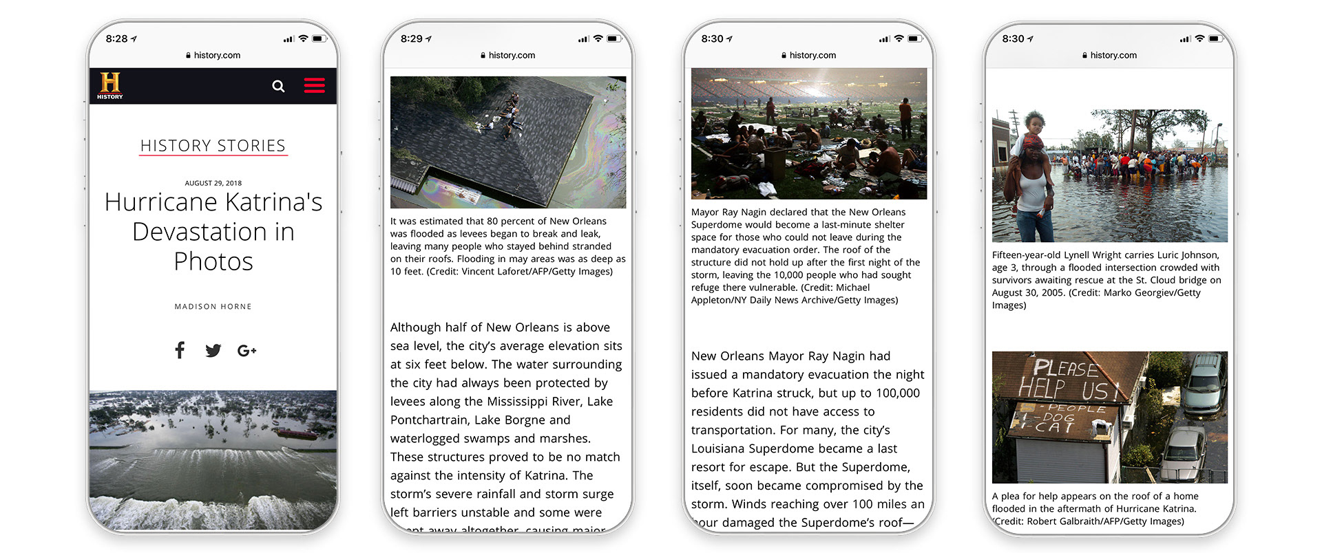
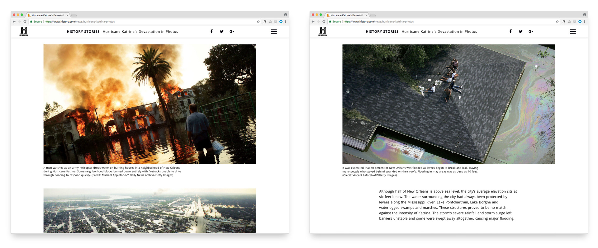
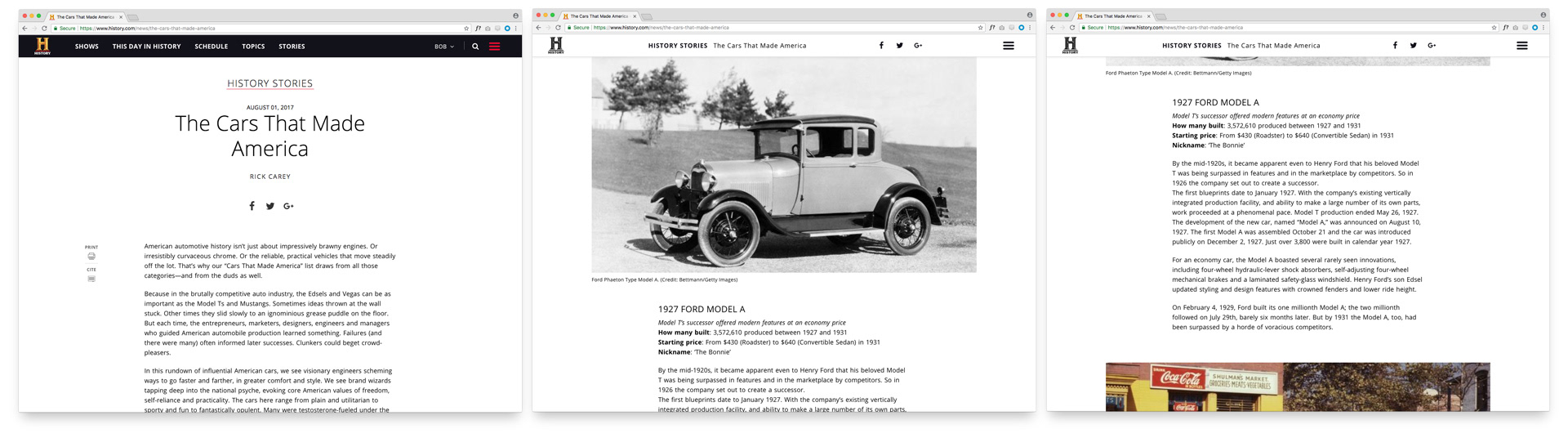
Article interior screens - photography, copy, negative space
The article experience was built around a deliberate tension between image and text. Full-width photography created moments of visual impact; generous negative space gave the eye somewhere to rest between them. The layout resisted the temptation to fill every pixel, a constraint that made the writing feel more considered and the photography more powerful. Reading a HISTORY story was meant to feel like sitting with a magazine, not scanning a feed.
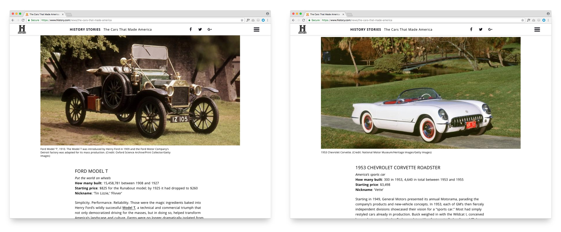
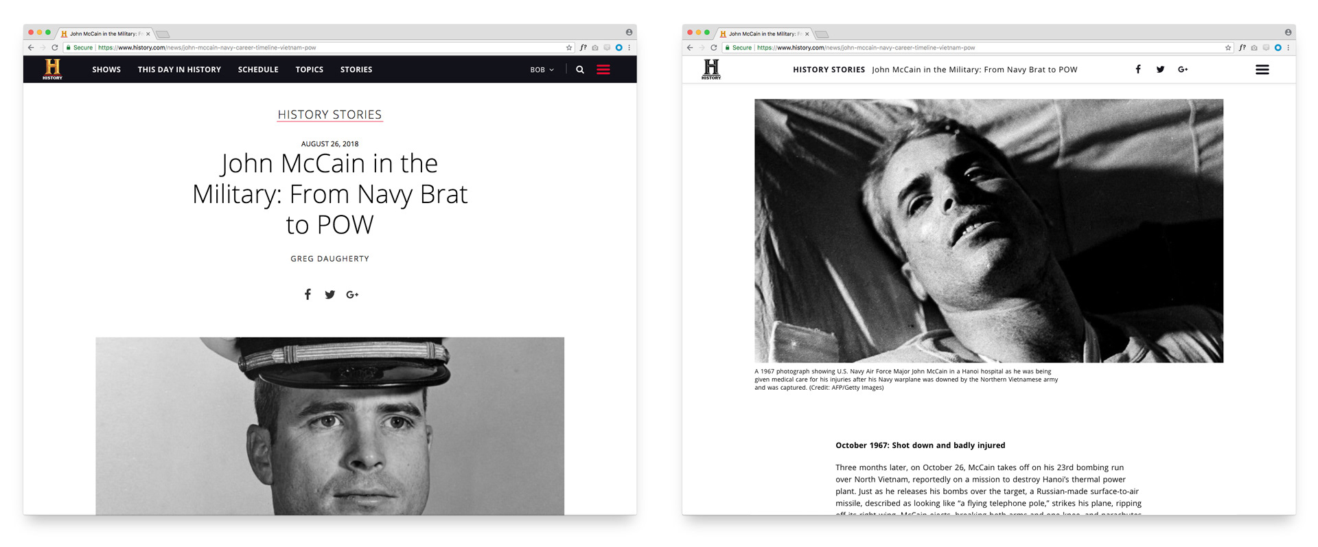
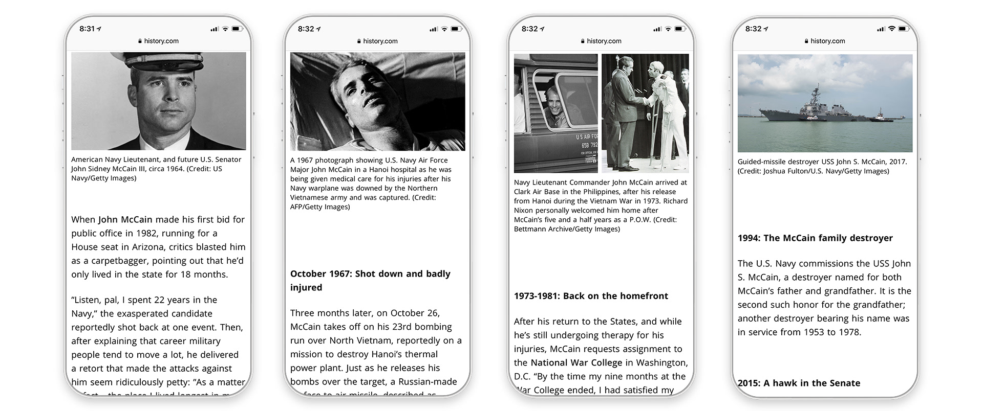
Additional article screens - varied topics and layouts
Across topics as varied as ancient civilizations, American political history, and cultural movements, the layout system held without becoming repetitive. The design was flexible enough to accommodate stories of different lengths, image ratios, and editorial tones, while maintaining the visual consistency that made the experience feel like a cohesive publication rather than a collection of one-offs.