MOBILE & CONNECTED TV
Peek View: Short-Form Content Discovery
A catalog of tens of thousands of titles is only as valuable as a viewer's willingness to choose one. And the friction of that choice is exactly the moment viewers give up and watch something they've already seen. Peek View was designed to solve that problem by removing the commitment cost of discovery entirely.
Built within Paramount Streaming for mobile and CTV, Peek View introduced a video-first browsing experience that let viewers sample content through short-form previews before deciding to commit to a full movie or series. On mobile, the experience took the form of a TikTok-style vertical feed. On CTV, it became a horizontal browsing experience navigable by remote, with content playing inline and actions accessible without leaving the feed. Both are designed to keep users engaged with snackable content and improve content discovery.
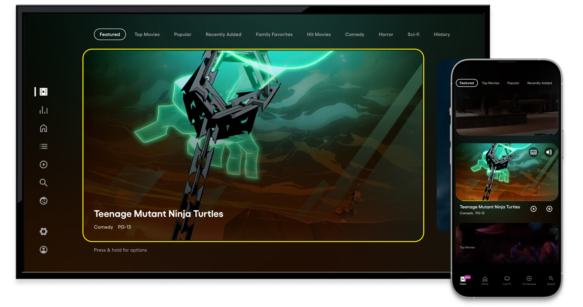
CTV and mobile - Peek View focus state, same content across both surfaces
This image made the design system's coherence most visible. The same content, the same feature, the same moment of user intent, expressed across two fundamentally different surfaces. On CTV, a bold yellow focus border highlighted the content, and metadata anchored to the lower left. Every element scaled for a 10-foot viewing distance and remote navigation. On mobile, the same content appeared in a vertical card format, active and playing inline, sized for a thumb and designed for a hand. One feature. Two surfaces. One coherent experience.
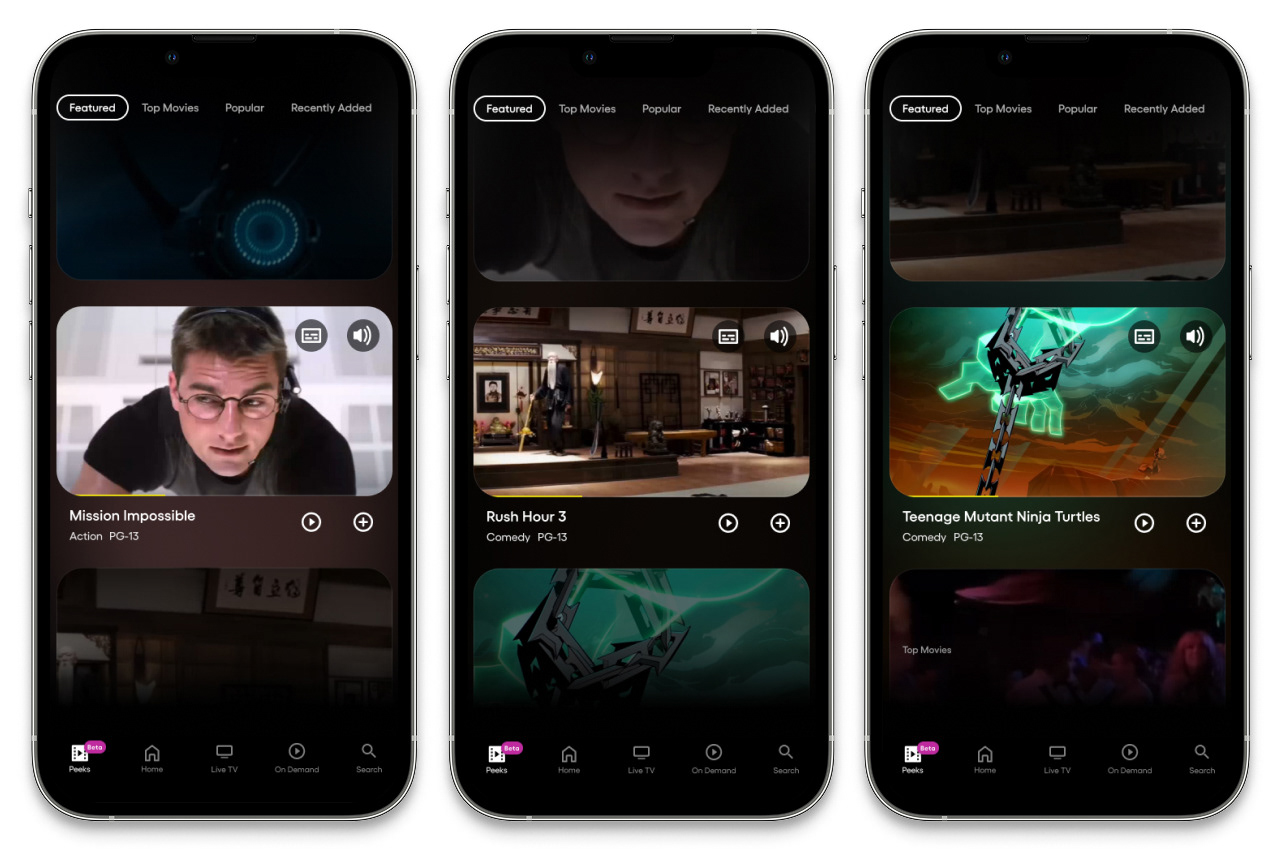
Mobile - Peek View vertical feed, active content cards with inline video
The mobile Peek View experience in portrait orientation was designed around the way people actually hold their phones, one hand, thumb-driven, vertical scroll. The screens above show vertical scrolling across three different content titles, each actively playing inline within its card. Video stills were visible in the cards above and below providing a sense of what was coming next. The active card sat prominently in the center of the screen, title, genre, and rating displayed below with Play and Add to Watch List actions immediately accessible. Subtitle and Audio controls appeared in the upper right corner of each active car, and accessibility was considered at the point of discovery, not buried in settings. The vertical feed's visual rhythm was consistent with content consumption patterns users had already developed on other platforms lowering the learning curve to near zero.
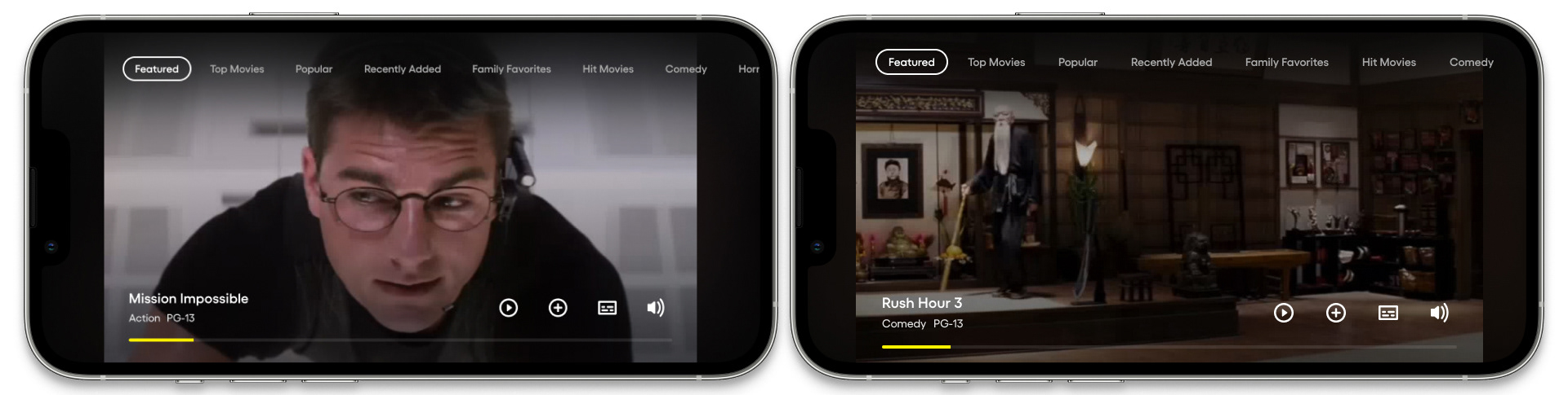
Mobile - Peek View landscape orientation, full video with action bar
Rotating to landscape on mobile delivered a lean, immersive viewing state that felt native to the device. Content filled the full screen with minimal UI. Title, genre, and rating anchored to the lower left, a yellow progress bar beneath indicating position within the clip, and four action icons aligned to the lower right. The yellow progress bar was a quiet but important detail: it communicated how much of the preview remained, giving viewers a sense of investment in the clip and a natural decision point approaching - watch more, or keep scrolling.
Active vertical manual scrolling
Passive vertical auto-scroll
Manual scrolling gave viewers full control of the pace. A swipe up moved to the next clip; a swipe down returned to the previous one, the same gesture vocabulary users had already internalized from other vertical video platforms.
For viewers who preferred to let the experience take the wheel, auto-scroll moved through the feed automatically, advancing to the next clip as each one completed, building a continuous viewing experience from short-form previews without requiring any input. The passive mode transformed Peek View from a browsing tool into something closer to a curated channel: each clip a low-commitment window into a title that might earn a longer look. The viewer could re-engage at any point, scrolling manually, or tapping an action.
The interaction model respected two distinct viewer modes simultaneously: the deliberate browser moving through clips with intention, and the passive viewer happy to let the content play.
Entering Peek View through global navigation - CTV
On CTV, Peek View was accessible as a dedicated destination from the global navigation, a first-class feature with its own entry point rather than a buried secondary mode. Selecting it from the left-rail navigation initiated a horizontal scrolling experience, content cards arranged in a row and navigable by d-pad. The transition into Peek View was designed to feel intentional and distinct, a change with a clear visual identity, not just a different layout of the same home screen. Category navigation across the top gave viewers immediate control over content type, allowing them to dive into a specific genre or browse the Featured selection before committing to a direction.
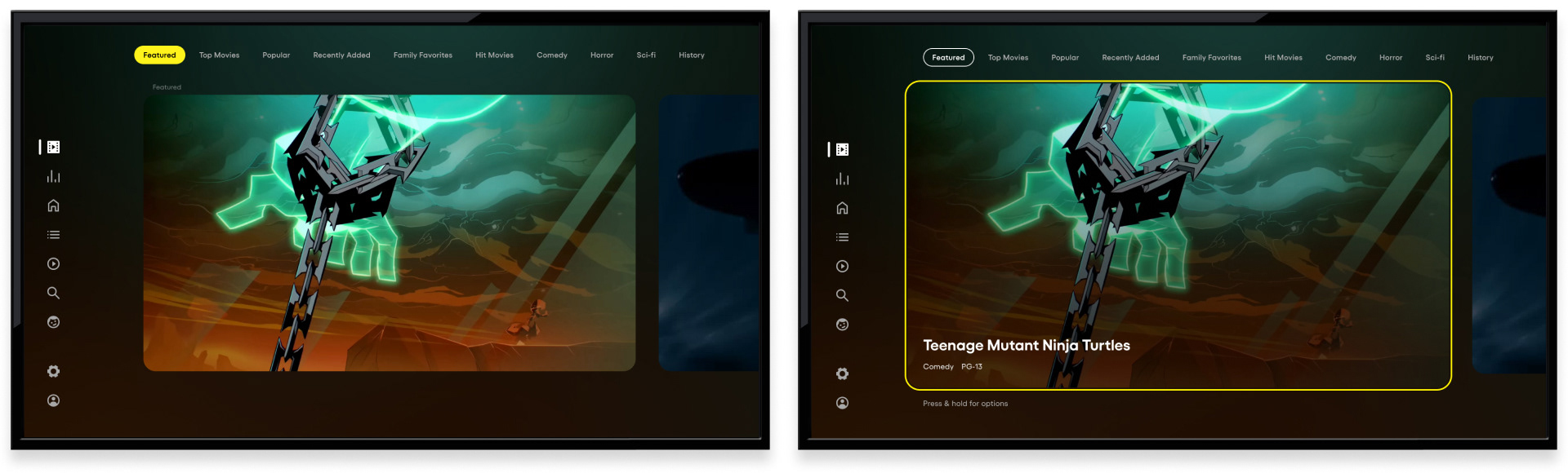
CTV - Peek View default state, category nav in focus. D-pad down to content card focus state with metadata
The CTV experience was designed around the remote, every interaction mapped to the natural movement patterns of a d-pad. The interface stepped back entirely and let the content do the work of attracting attention. Moving focus onto the card triggered an immediate state change: a bold yellow focus border appeared, title and metadata surfaced at the bottom of the card, and a subtle "Press & hold for options" helper text appeared below - teaching the interaction without interrupting the viewing experience. The information hierarchy was deliberate: the content came first, always. Metadata and actions appeared only when the viewer signaled intent by moving to the card.
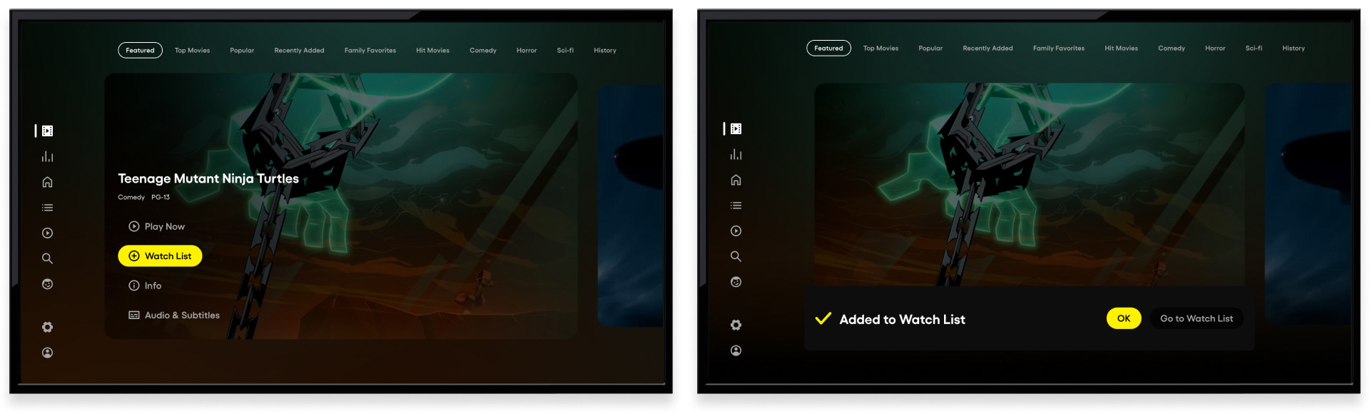
CTV - Peek View engagement overlay and Watch List confirmation
Within Peek View on CTV, the long-press interaction surfaced a focused action overlay (Play Now, Watch List, Info, and Audio & Subtitles) giving viewers a direct path from preview to commitment without leaving the short-form experience. The example above shows the Watch List action highlighted in yellow, the interface's primary action color. One of the most common intentions in Peek View is saving content for later. The confirmation state demonstrated one of the more considered micro-interaction decisions in the feature - a checkmark and "Added to Watch List" message appearing at the bottom of the screen. The confirmation closed the loop on the interaction, and gave users confidence the action had completed.
Press and Hold activates additional engagement features - CTV
The long-press interaction on CTV surfaced a great way for viewers to quickly scan content and either start video playback, build their watch list, or dive further into content details. The design kept the default state clean and the advanced actions accessible, serving both the casual browser who just wanted to watch clips and the engaged viewer ready to act.
Micro-animations - content card entry points on Home and On Demand
Discovery didn't begin and end within Peek View itself, additional entry points were embedded throughout the broader app experience. On the Home Screen and On Demand surfaces, a small film strip icon in the lower right corner of eligible content cards signaled that a preview was available. When focus landed on the card, a subtle micro-animation activated without interrupting the browsing flow. The animation was small by design: noticeable enough to register, restrained enough not to distract. It did exactly what a good micro-interaction should do - informed the user, invited an action, and stepped back immediately.
Peek View launched in Beta across Paramount Streaming's mobile and CTV surfaces - a new content discovery paradigm for a platform with one of the most extensive entertainment catalogs in streaming.