RESPONSIVE WEB: DESKTOP, TABLET, MOBILE DEVICES
The Obama Years: A Nine-Part Oral History
Designed to accompany on-air programming on the HISTORY channel, this responsive web experience was built around something rare: direct, extended access to a sitting president. Two interviews with President Barack Obama, conducted both before and after the 2016 presidential election, formed the spine of a nine-part oral history covering his time in office in his own words. His successes, his failures, his unfinished business, and what he hoped would endure.
The project expanded outward from there, weaving in perspectives from 24 members of his staff, Congress, and the press - creating a layered, candid account of an administration reflecting on itself in real time on their proudest moments, their regrets and the belief that they left it all on the field. The design challenge was to match that gravity: to build an experience as considered and unhurried as the content itself, one that let the photography and testimony carry the weight without getting in the way.
Industry recognition: The Obama Years was nominated for a Webby Award and recognized as an Honoree in the 2017 Television category.
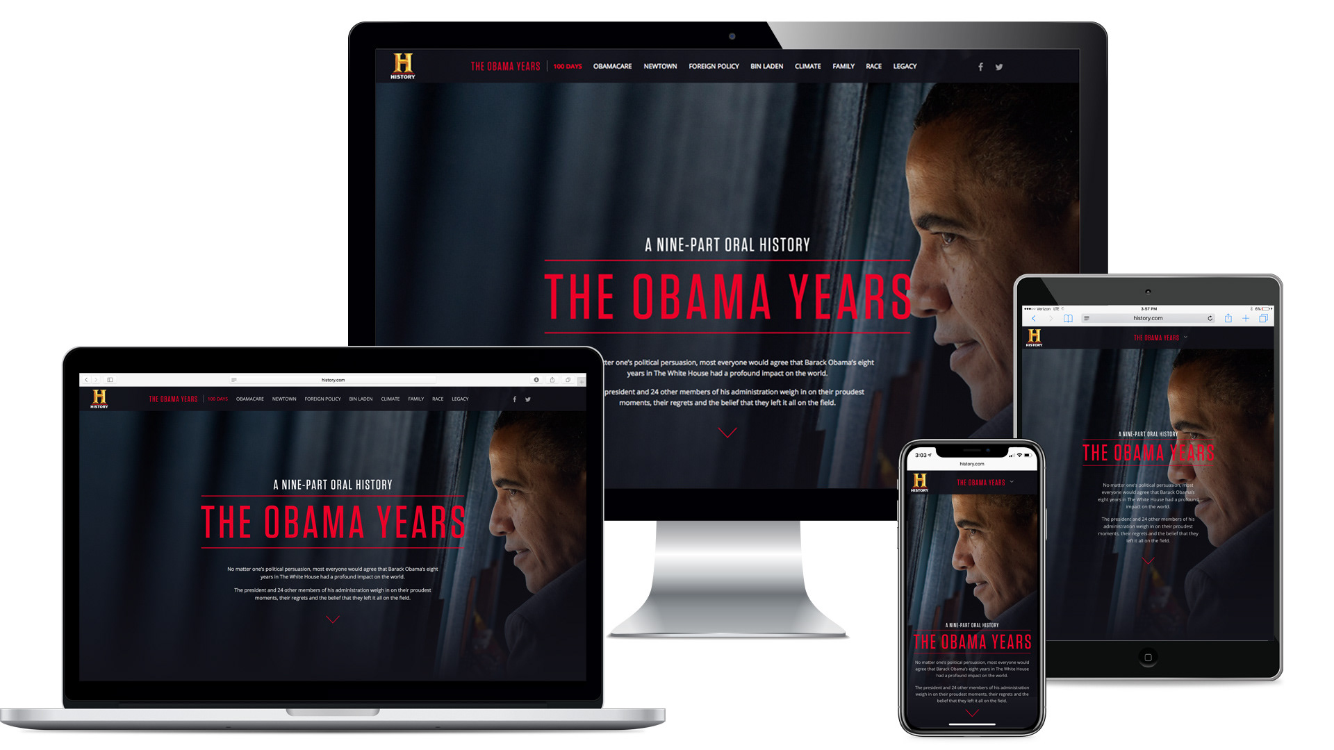
Responsive layouts - multiple screen sizes
The experience was built responsively from the ground up, translating seamlessly across desktop, tablet, and mobile. The visual hierarchy and editorial pacing held at every breakpoint, no viewport felt like an afterthought.
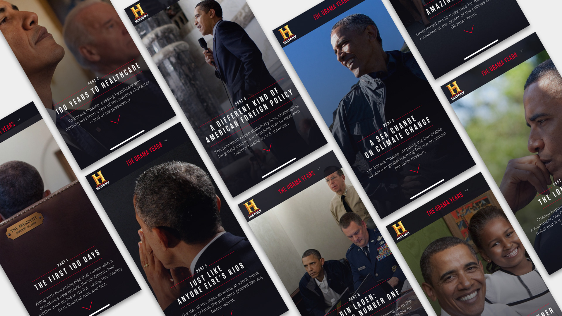
Chapter landing screens - mobile
Each of the nine chapters opened with a dedicated landing screen: a full hero image, title treatment, and contextual description establishing the subject before the testimony began. The structure gave readers a moment to orient - a breath before the history.
The interior screens were designed around the rhythm of testimony and image. First-hand accounts from the President and his administration were paired with supporting photography, creating an editorial experience that felt more like a long-form magazine feature than a broadcast companion site.
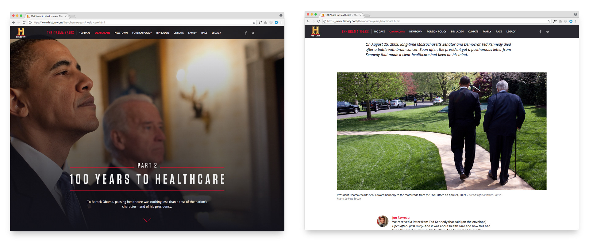
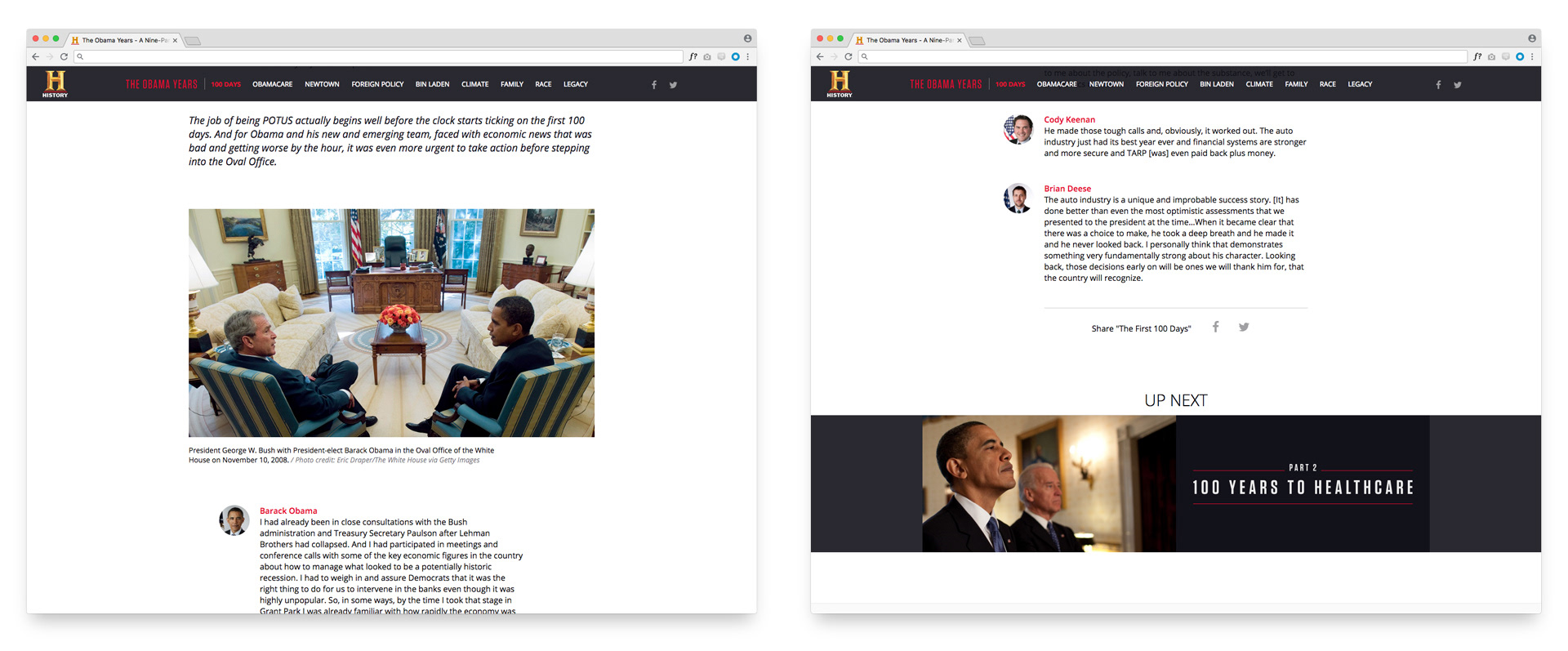
Interior screens - desktop
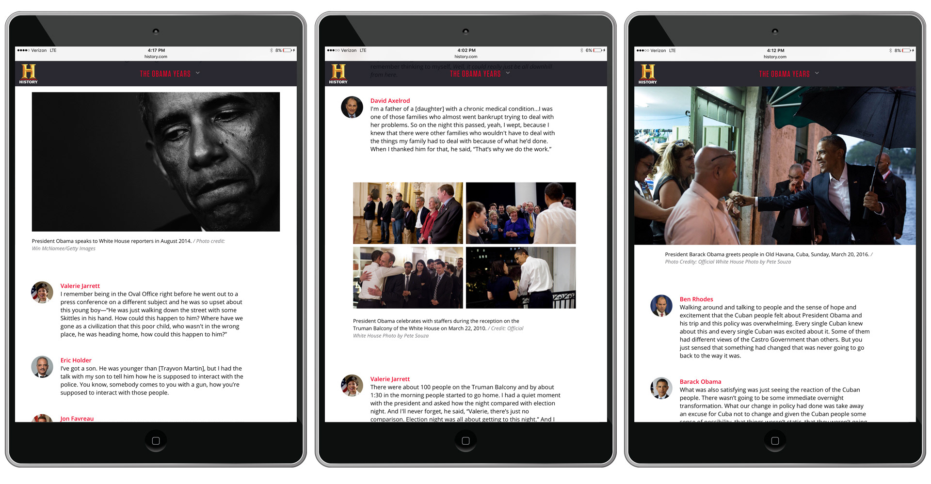
Interior screens - tablet
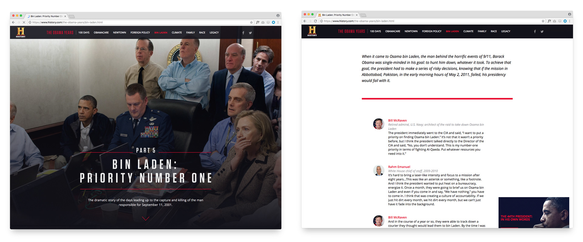
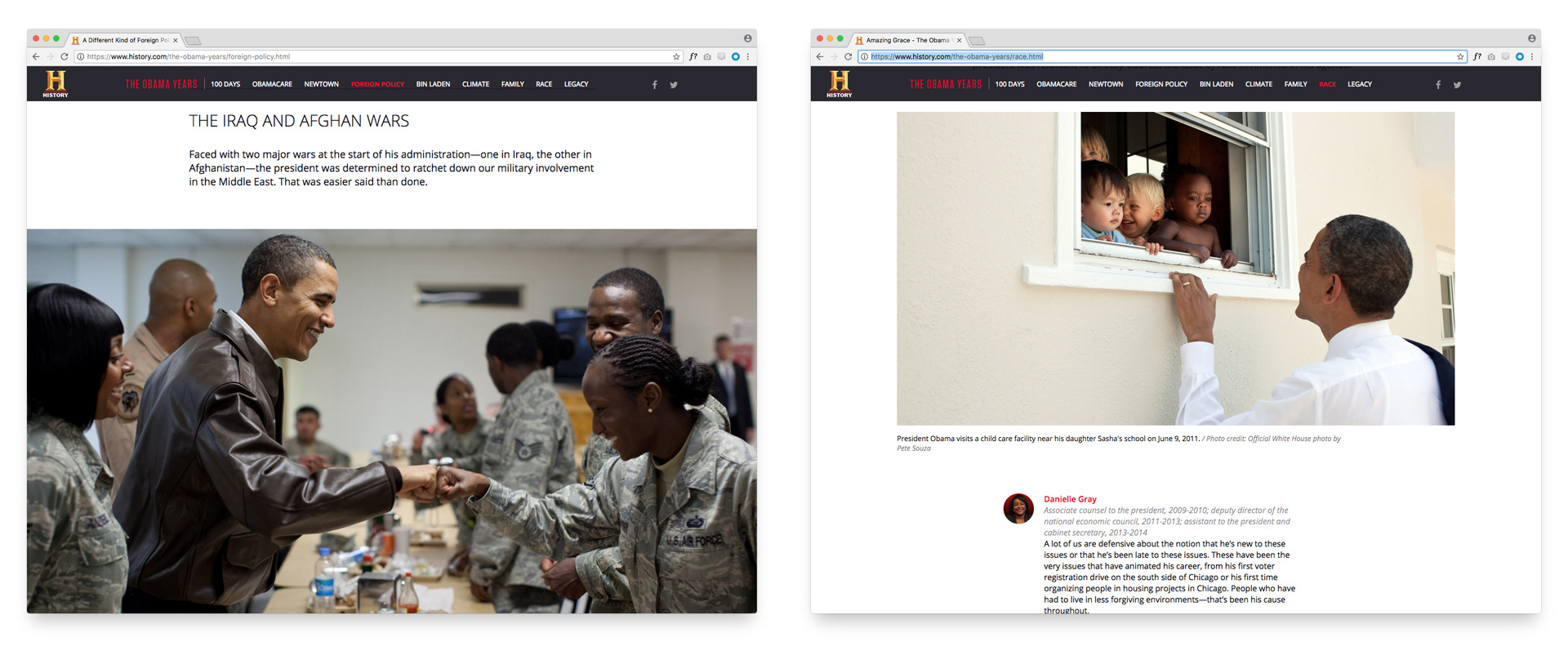
Interior screens - desktop
Full-width photography ran throughout, bringing a cinematic quality to the experience. The images weren't decorative — they were structural, anchoring each section with a sense of moment and place that reinforced the historical weight of the content.
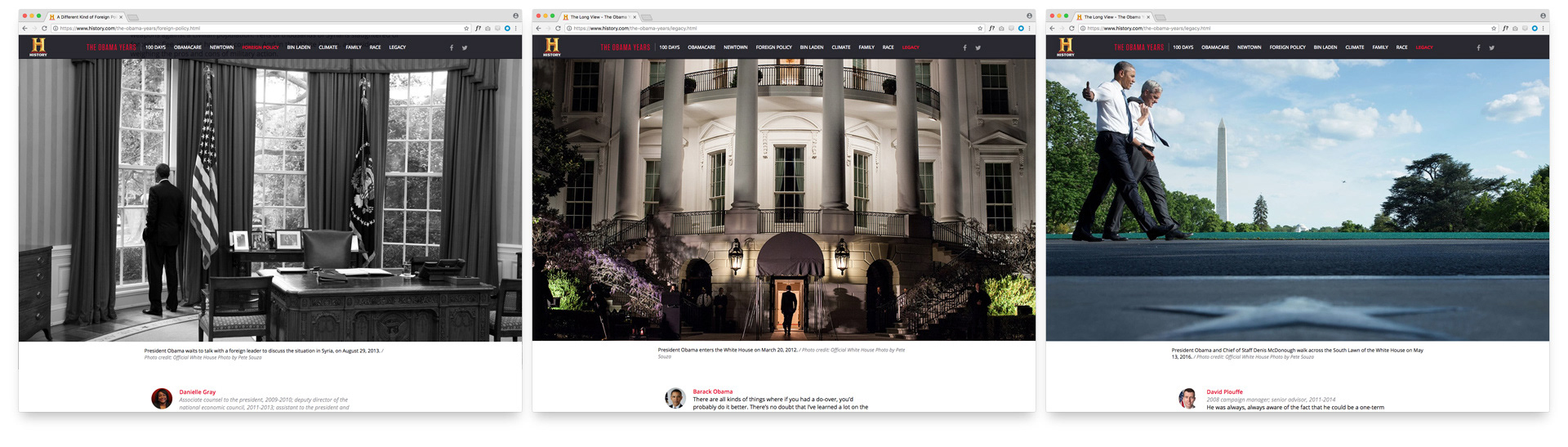
The incredible full width photography added a premium feel to the entire experience.