RESPONSIVE WEB
A+E Global Media Corporate Website
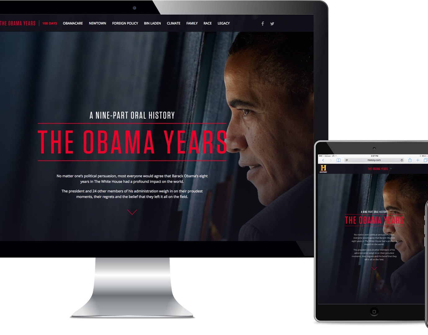
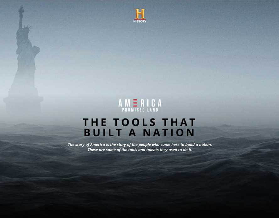
A corporate website is rarely the most glamorous design project. But for a media company competing for talent, advertising dollars, and industry credibility, it might be the most consequential one. A+E Global Media, a portfolio of six legacy brands including A&E, HISTORY, Lifetime, and FYI, needed a digital presence that reflected who they actually were: a creative powerhouse with a genuine culture, serious business scale, and a track record that earned attention.
The redesign covered everything from brand positioning to content architecture to backend infrastructure - a full-scope engagement that delivered not just a new site, but a scalable CMS system built for years of consistent, low-maintenance operation. The project launched in phases, with the most critical components first, and was designed from the outset to require minimum upkeep once live.
The result outperformed every major TV competitor in design quality and operational maturity, and set a bar for corporate web presence in the industry.
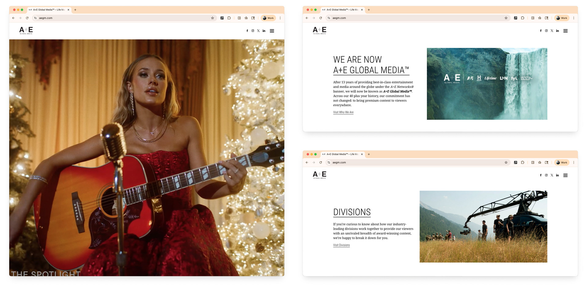
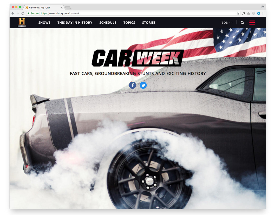
Home screen - sizzle reel hero, section navigation
The home screen made an immediate case for the company without a word of copy. A full-screen sizzle reel opened the experience - content from across the A+E portfolio playing on arrival, establishing creative range and production quality before any navigation had been touched. Scrolling downward revealed a high-level map of the site's sections, each accessible with a single click and designed to pull different audiences - buyers, press, prospective employees - toward the content most relevant to them.
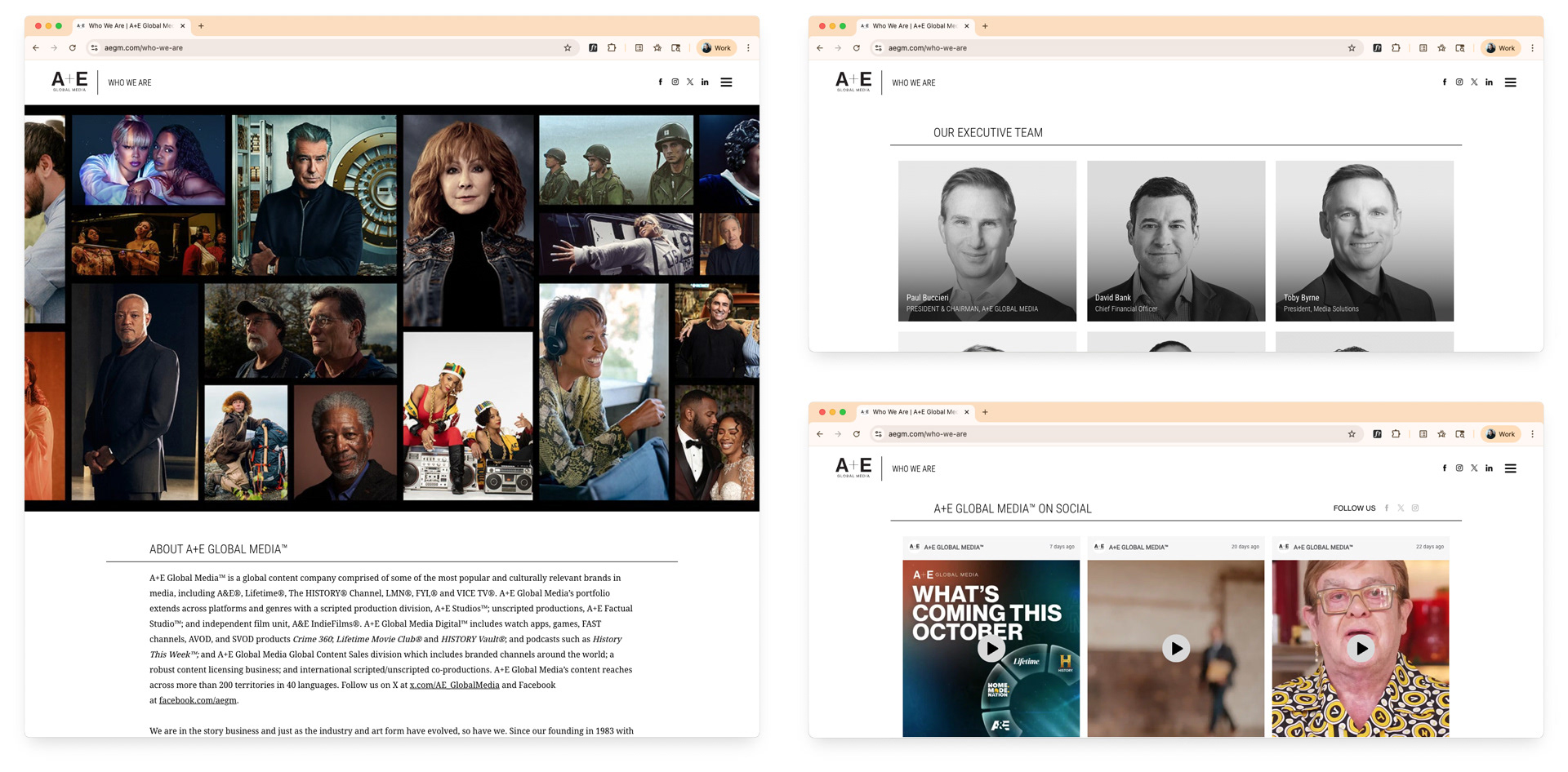
About section - leadership, news, social feeds
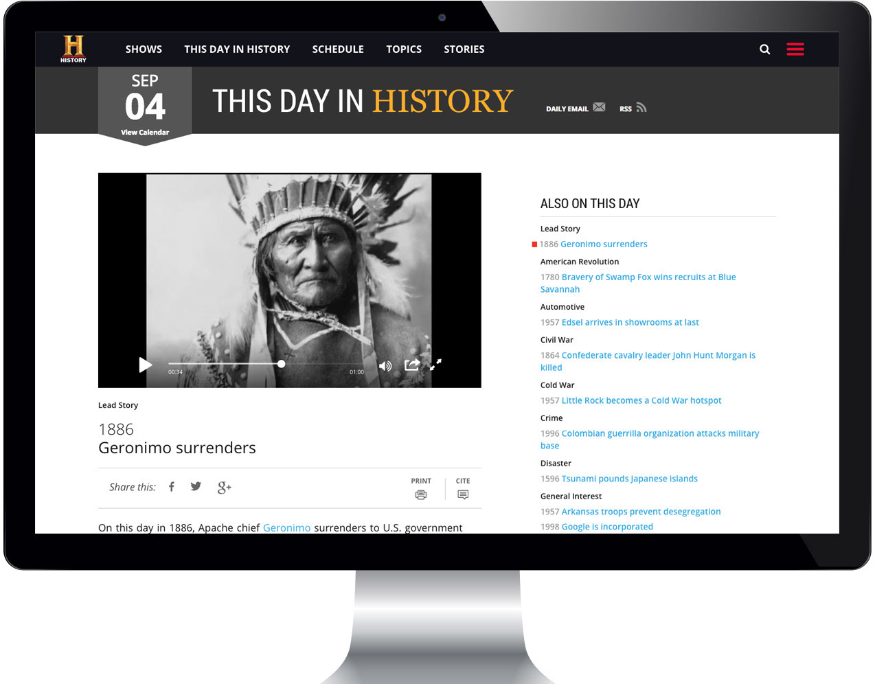
The About section positioned A+E as an organization with depth and momentum. Company history, executive leadership, and the latest news were all present, alongside regularly updated social feeds that kept the site feeling current without requiring constant manual editorial effort. The design was built on reusable templates and components that made consistency automatic and updates straightforward for the internal teams managing the site day-to-day.
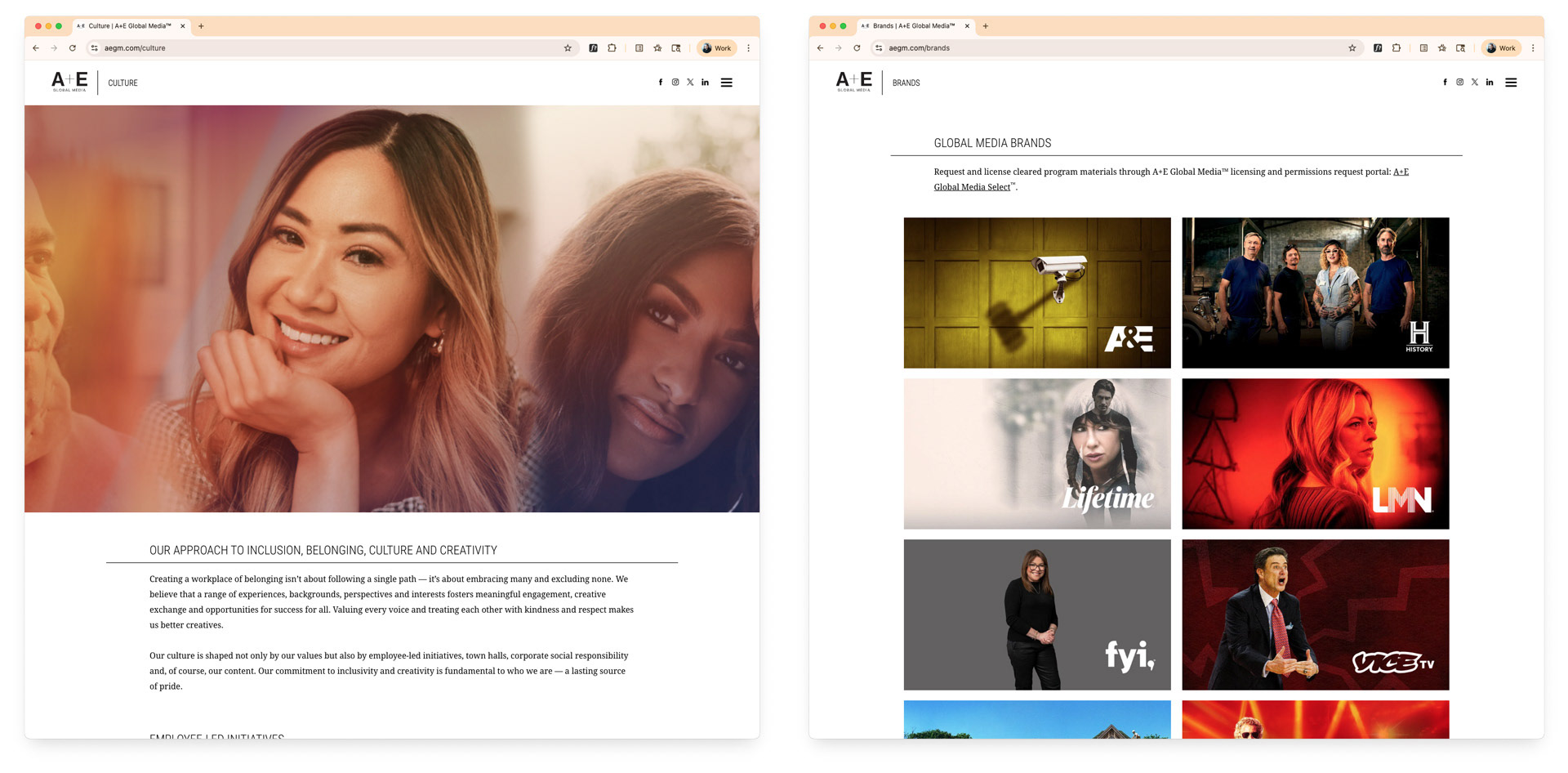
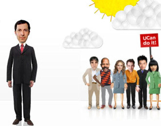
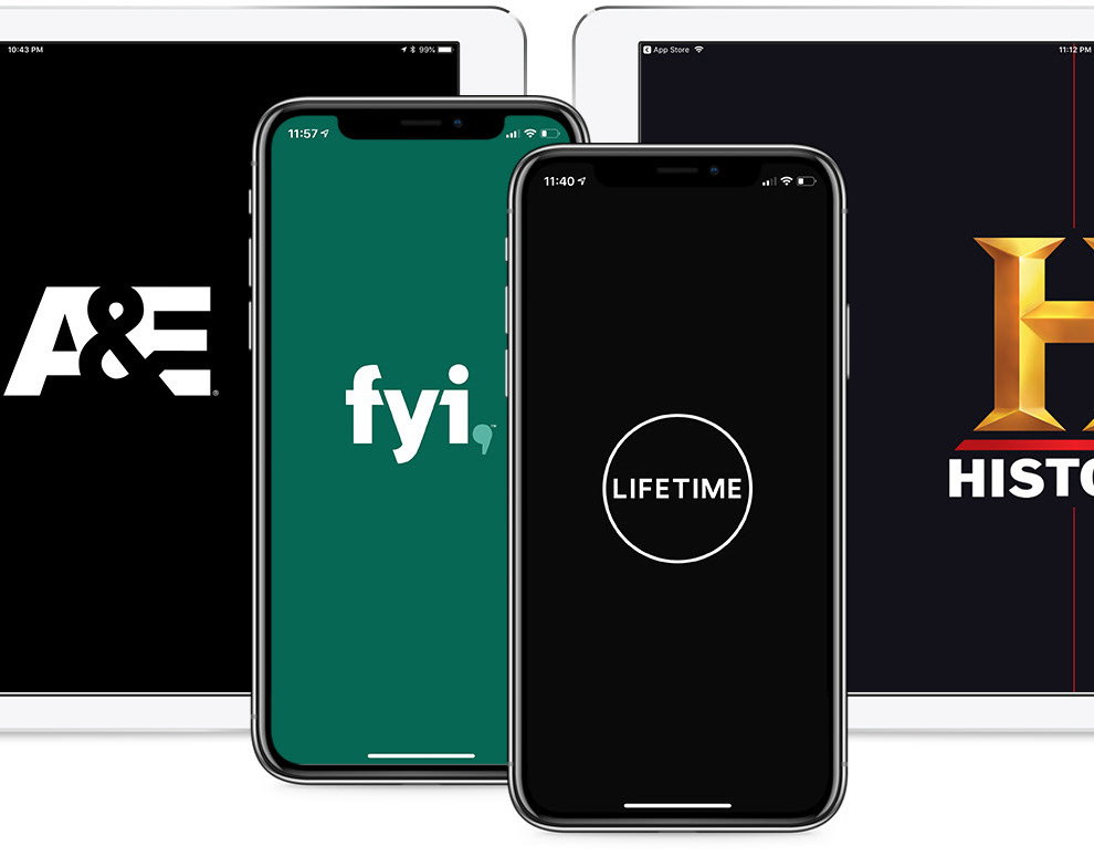
Culture section - brand portfolio showcase
The Culture section served two audiences simultaneously: industry peers evaluating the company's positioning, and prospective employees trying to understand what it would actually feel like to work there. Showcasing the full brand portfolio gave visitors a clear sense of the company's reach and creative diversity - six distinct brands, one coherent organization. Transparency about culture was a deliberate choice: the best talent makes decisions based on more than compensation, and the site needed to give them something real to evaluate.
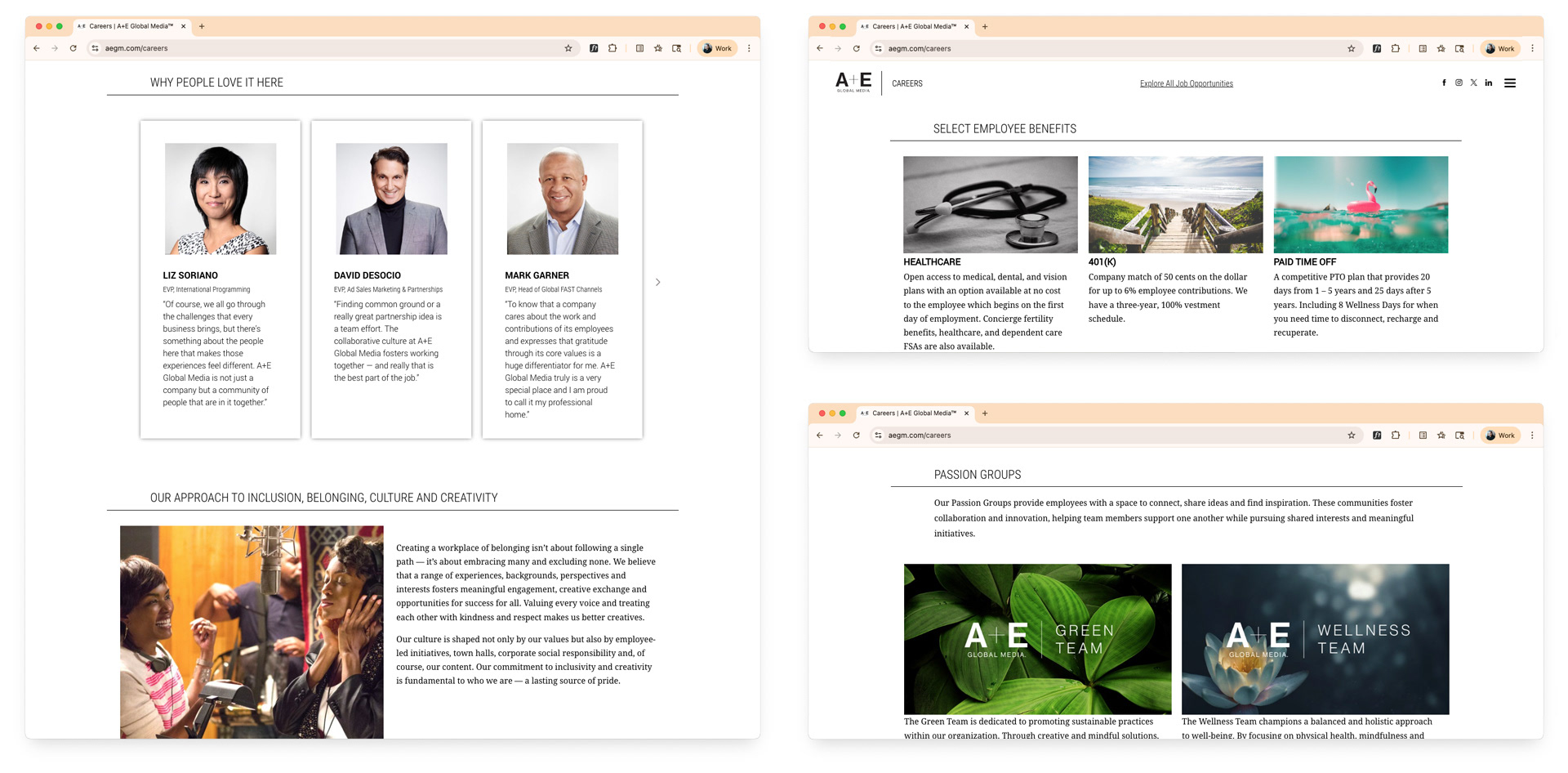
Careers section - culture, employee groups, benefits.
The careers section was designed with a specific business goal: improve both the quantity and quality of applicants. Rather than a standard jobs board, the section made the case for A+E as a workplace, surfacing employee perspectives, the groups and communities people had access to, and the benefits that reflected the company's values. The design gave candidates enough honest context to self-select meaningfully, which benefited recruiting teams as much as applicants.
The project was delivered in multiple phases, prioritizing the highest-impact sections and components first and building outward from a stable, scalable foundation. The CMS architecture was built for longevity: consistent content management, minimal technical overhead, and a maintenance process designed to sustain quality over the long term without requiring ongoing design intervention.
For a company in the business of storytelling, the site finally told A+E's own story the way it deserved to be told.